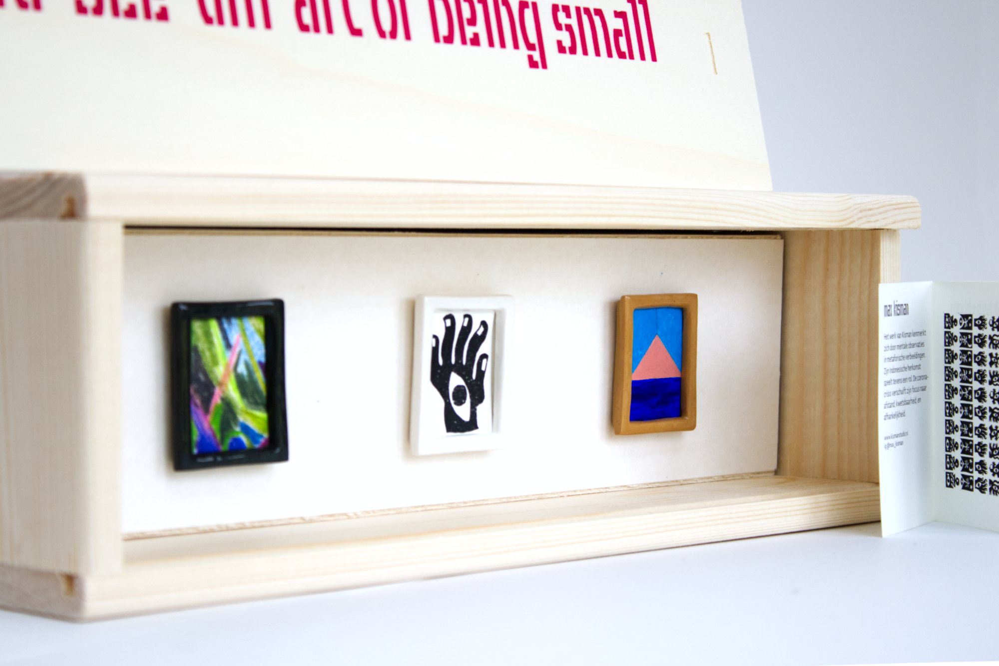
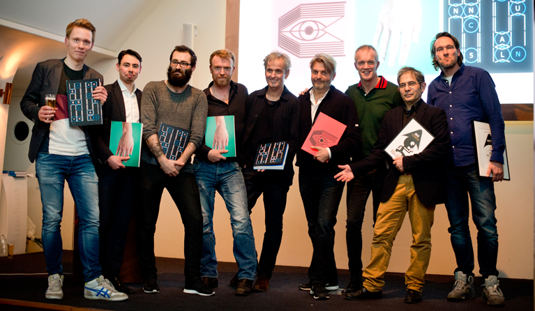
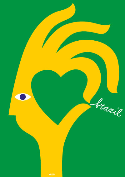
mu-see-um, art of being small (2020_1214) Holiday gift tip! For only €166 (excl. shipping) you give yourself or someone else a mini museum with three original works by Max Kisman, Kars+Boom, Britt Dorenbosch in ceramic frames by Mianne de Vries. Signed framed and wrapped! Check it out at mu-see-um.nl or order at bykisman.com
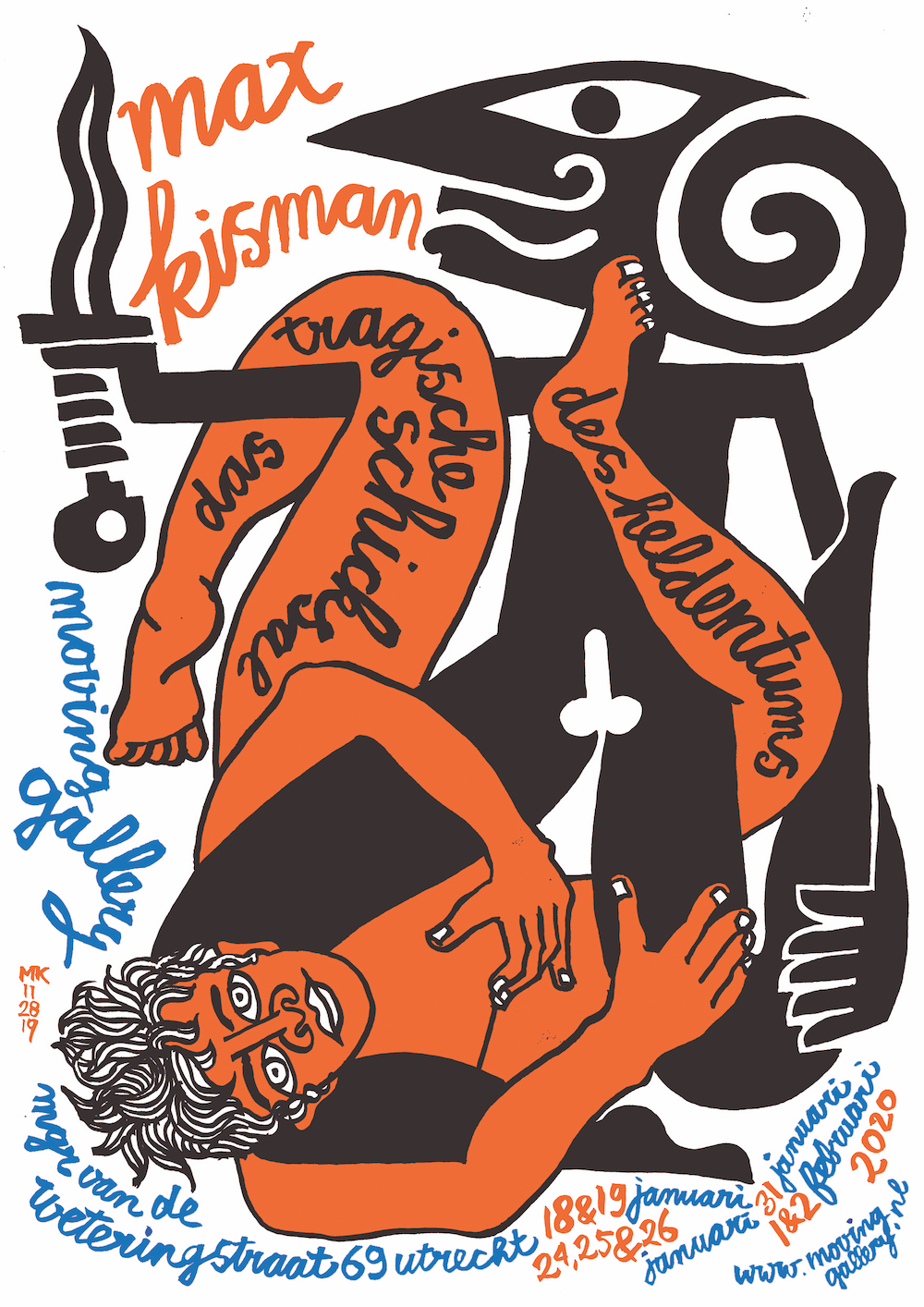
Das tragische Schicksal
des Heldentums Solo concept exhibition. 18 januari t/m 2 februari 2020. Moving Gallery Utrecht. More
A shadow story As an extension of my graphic and iconic black and white figures, I created the shadow installation "Das tragische Schicksal des Heldentums". In this installation, referring to my diluted Indonesian origin and the Indonesian Wayang Kulit, recited texts (in English and Dutch) and underlying sound textures are combined with randomly emerging moving shadow figures. This creates stories in an associative manner that metaphorically refer to desire, connection, abandonment, exploitation, identity and origin. Behind the canvas are some sets of rotating and static laser-cut figures that are randomly exposed by relay-controlled spots. The installation needs a darkened space of approximately 3m wide x 3m deep x 2.5m high with a nearby socket (s).
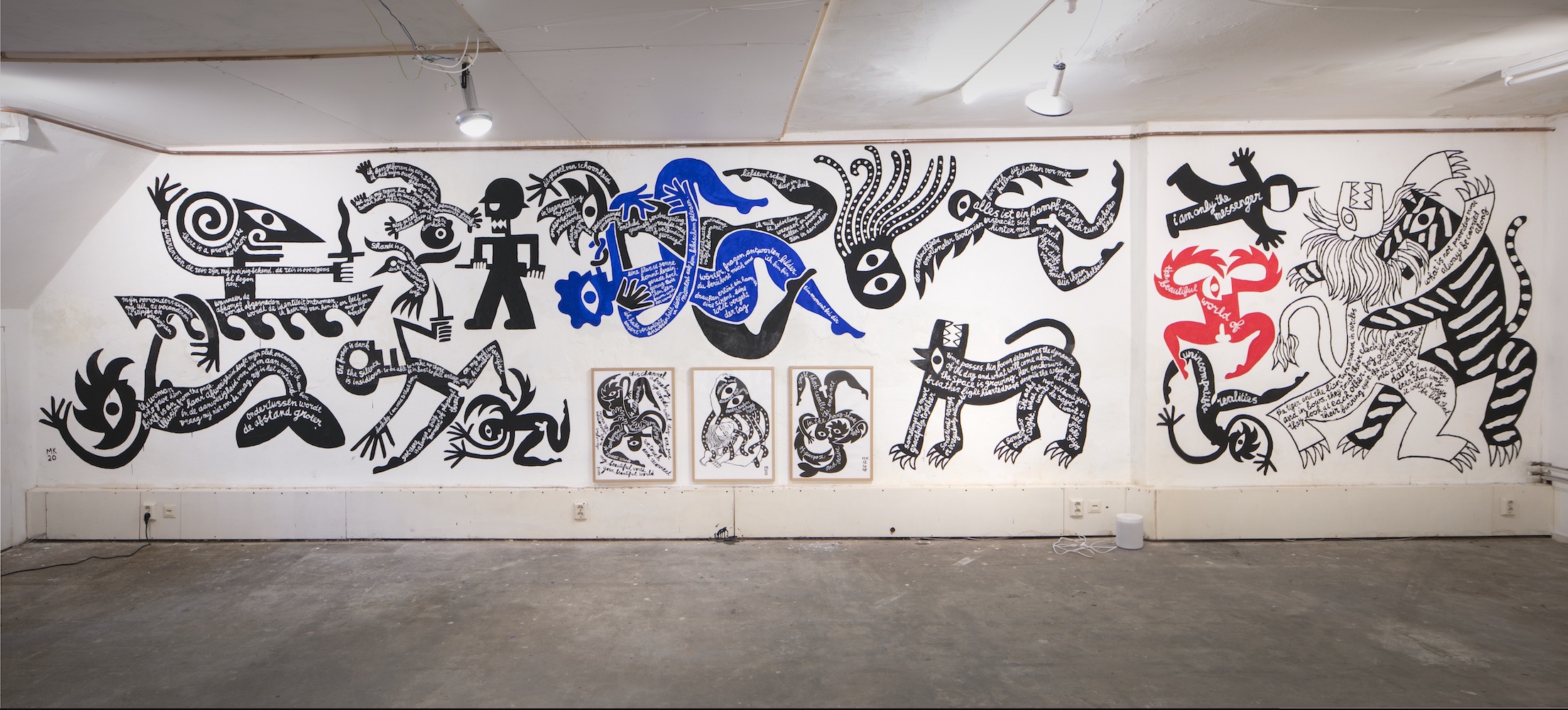
Mural (Heldentum)
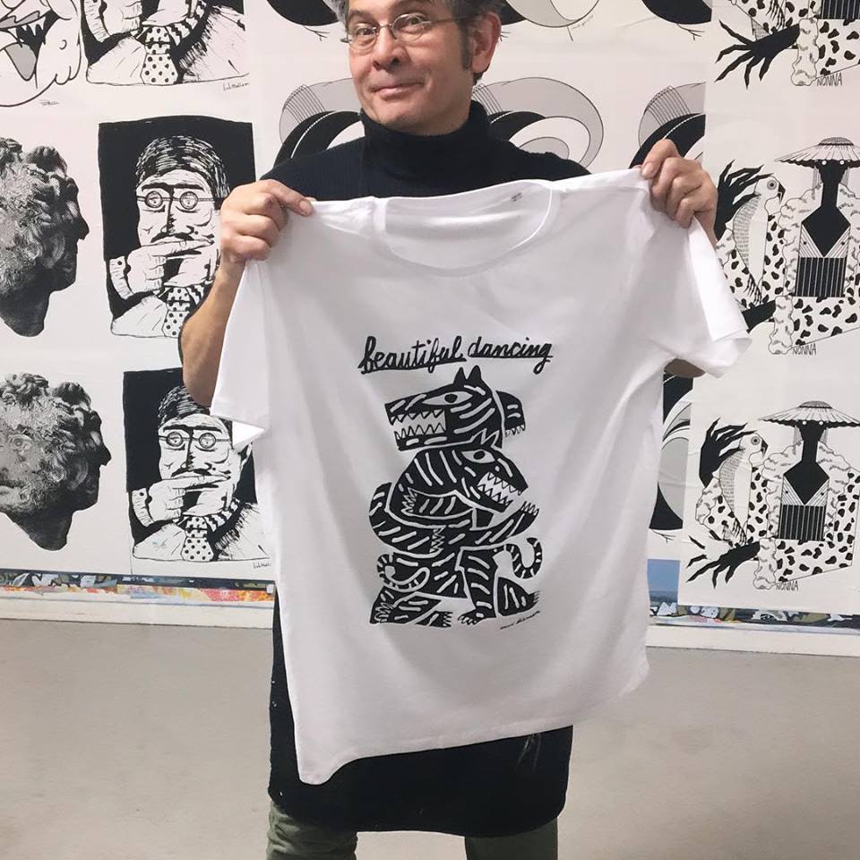
Beautiful dancing
(2019_0110) Max Kisman will issue each month a special T-shirt in a limited edition of 15. January 2019: ‘Beautiful Dancing’. Black print on a white Stanley-Stella short sleeve T-shirt. €30 + shipping bykisman.com
Availability: 3 x small (eu), 8 x medium (eu),2 x large (eu), 2 x extra large (eu)
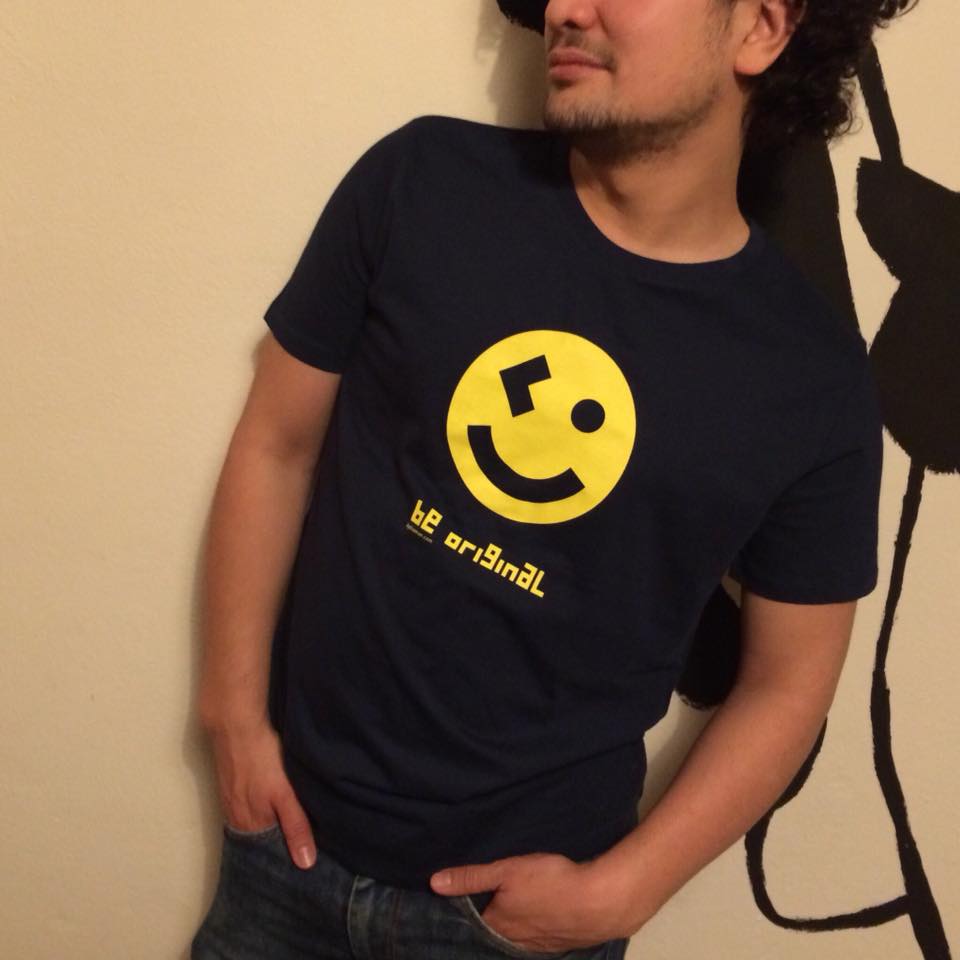
BE ORIGINAL - A Kisman classic Available as HOODY for boys and T-SHIRT. Made from 100% BIO COTTON from Stanley / Stella and LOCALLY printed. http://www.bykisman.com #beoriginal #kidswear #children #golocal #biocotton
Buy Kisman products from
10 March 2018: opening of ‘The dark side of Dick Bruna’ exibition in the Kunsthal Rotterdam
12 September 2017: Pixels&Paper BNO Utrecht € Sensorllab, Plompetorengracht 4, Utreccht, 19:30 8 June 2017: Fiep Westendorp/Talens day Two lectures and meet & greet. Apeldoorn NL 23&24 May 2017: WDCD Life action, drwaing speaker portraits and congress impressions. Amsterdam NL 17&18 May 2017: Plug&Play Porto
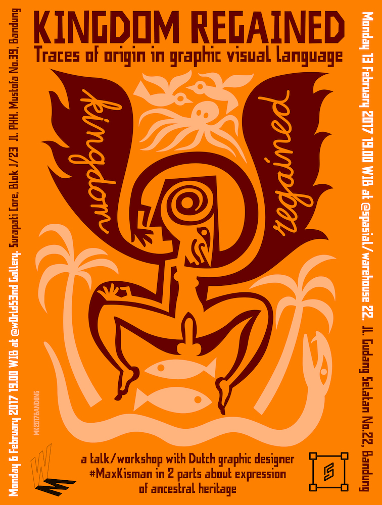
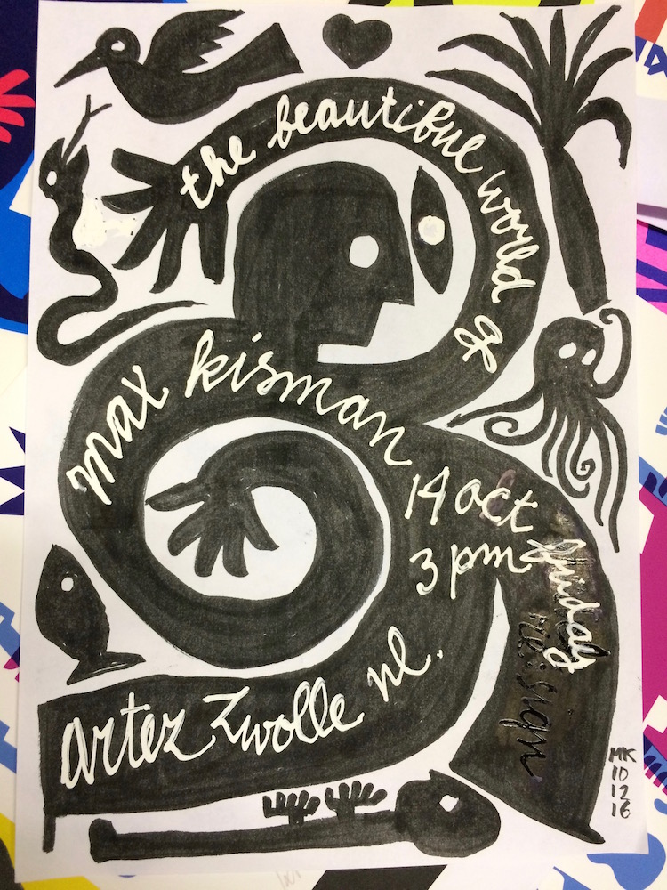
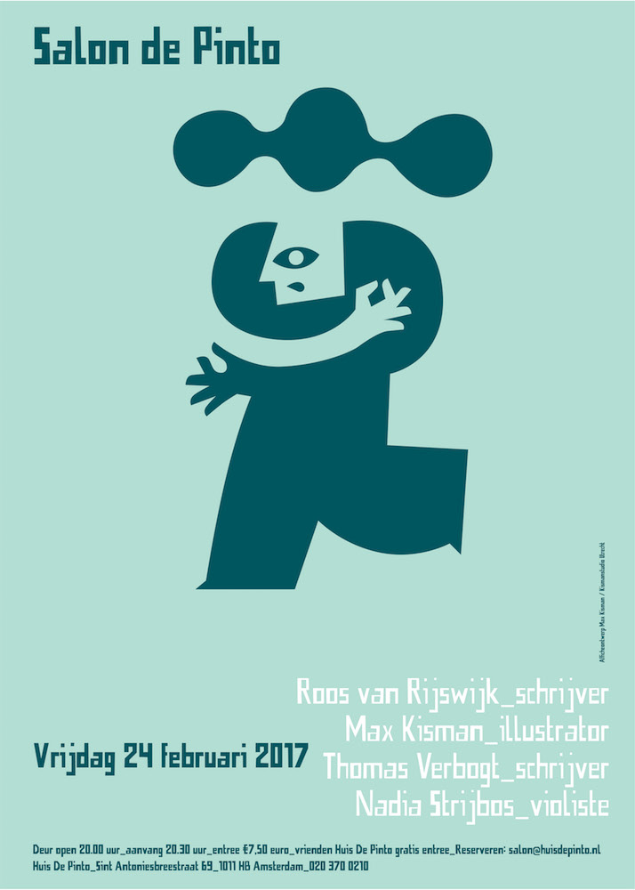
Congress on illustration, typography, editorial design, motion design, web design and multi media. 24 February 2017: Salon de Pinto With Roos van Rijswijk, Max Kisman, Thomas Verbogt en Nadia Strijbos. Huis de Pinto, Amsterdam 6&13 February 2017: Kingdom Regained Traces of origing in visual graphic language, talk/workshop. Wold's End/Spacial, Bandung Indonesia 14 October 2016: The beautiful world of Max Kisman presentation at Artez, Zwolle NL
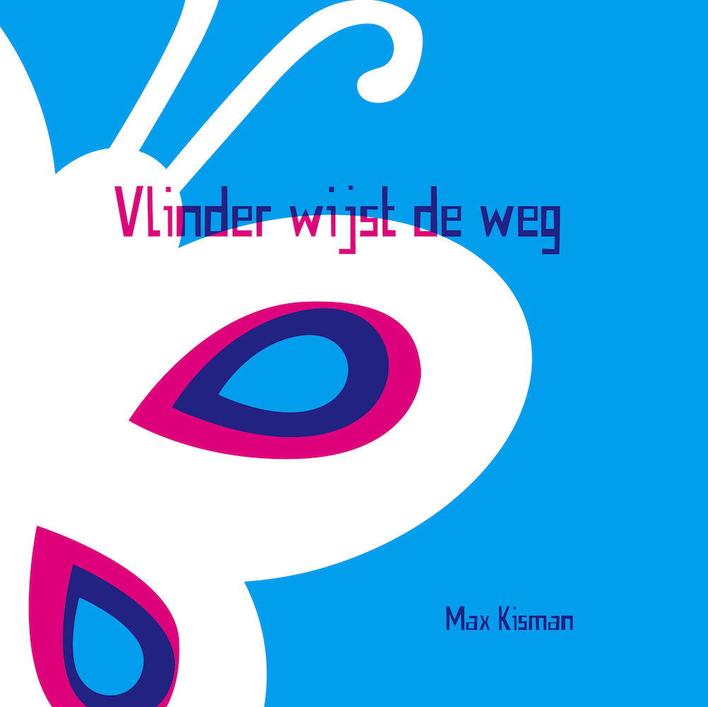
Vlinder wijst de weg Short trailer 29"
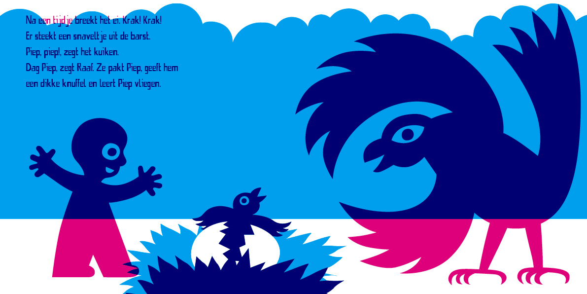
Vlinder wijst de weg A children's book
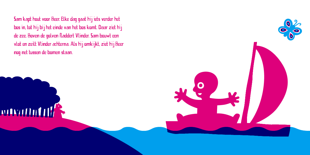
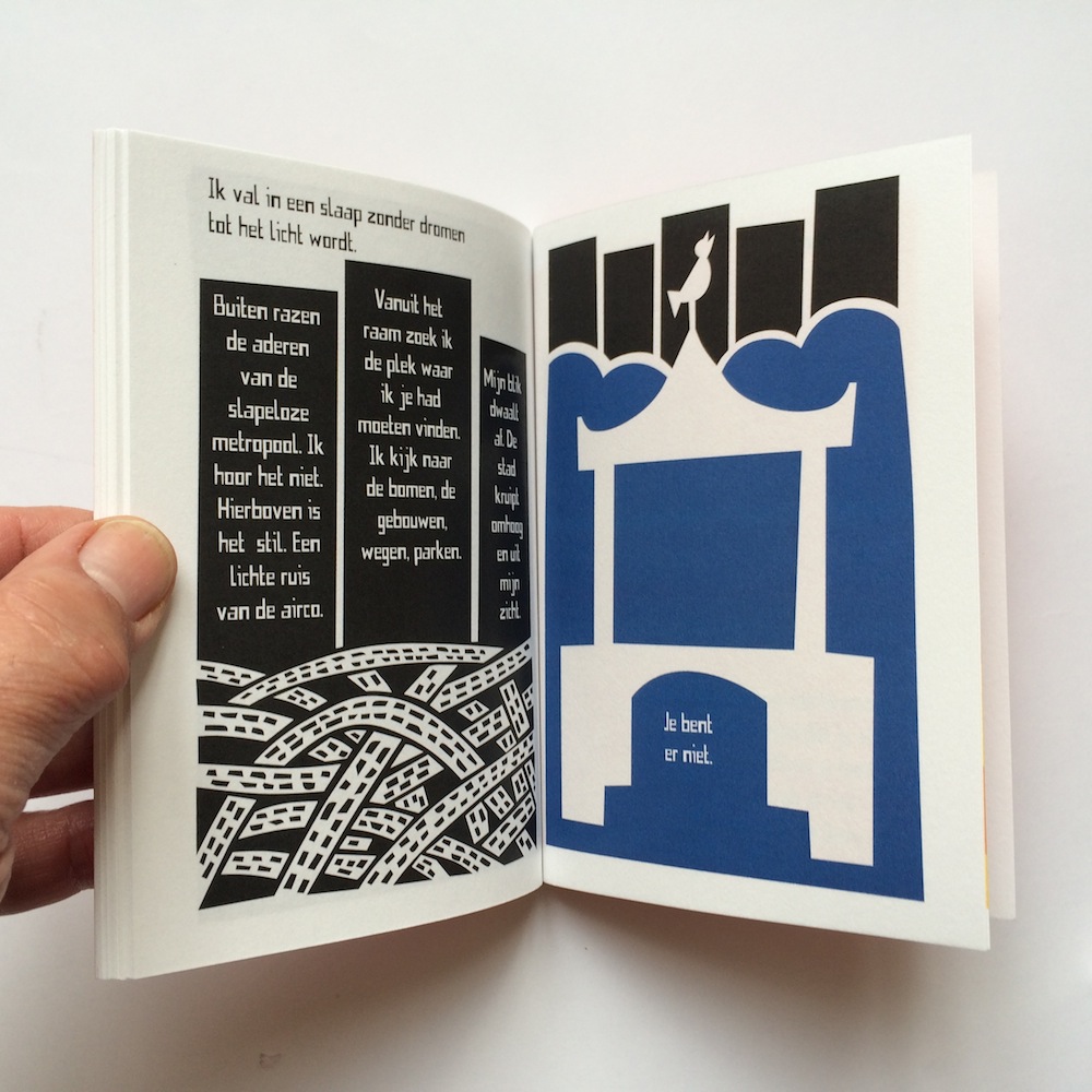
Sam flies. The wind whizzes in his ears. He lands in a clearing in the woods. There he sees a butterfly that glows. When he chases the butterfly, he gets lost. You're not lost though, a bear, a whale and a raven say, Butterfly always points the right way. They take him on an adventure until he comes back to where his journey began.
This first limited edition will be released in Dutch on the occasion of the exhibition 'Forever young - Fiep Westendorp and Max Kisman' in WG Kunst in Amsterdam, 17 September - 30 October 2016
32 pages, hardcover, 21x21 cm
Two color offset, blue en red
Published byBykisman
ISBN NL: 978-90-823058-2-1
NUR 271
125 regular copies, 75 numbered and signed with unique signed Kisman riso print.
Prices regular issue €17,50, special €27,50.
Will be available from 17 september 2016 during the exhibition and at bykisman.com see also >>
We fly. Mural Beverwijk NL
We fly every day
back and forth from here to there
in our dreams sometimes too at night
(2016_0225) As part of the reclassification of the ‘head of the harbor’ in Beverwijk NL. Kisman got the contract for the decoration of the connection on the Viaductweg between the old port and the town center.
The design refers to the need to move fast. In haste we say we fly. So we fly every day from here to there, and sometimes we fly at night in a dream.
Tunnels and viaducts are perfect metaphors for "from here to there." They are inevitable obstacles in the way to the other side.
The project will be deliverd end April 2016.
See also Beverwijk.nieuws.nl (Dutch).
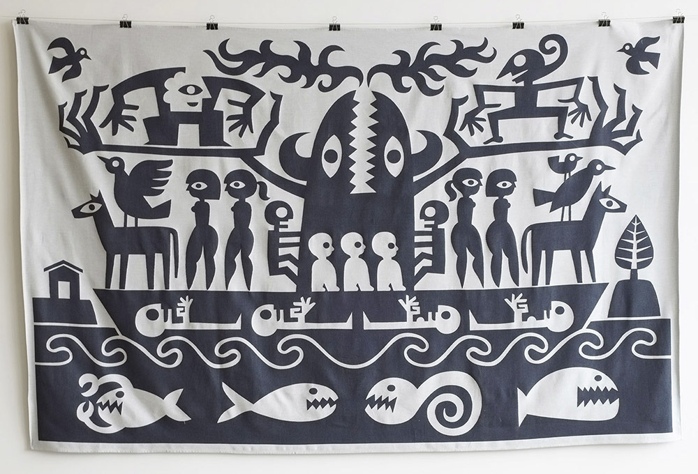
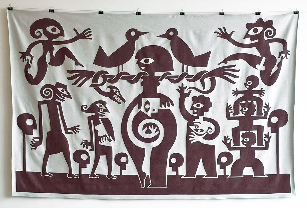
Also available: The Triptych ‘Ancestral Migration’ of textile wall hangings
was exhibited at the Indonesian DNA exhibition and is available at bykisman.com
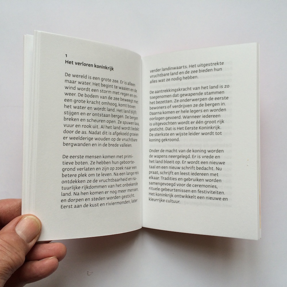
The lost kingdom The symmetry of life
Heirs and Sons
Until September 2014
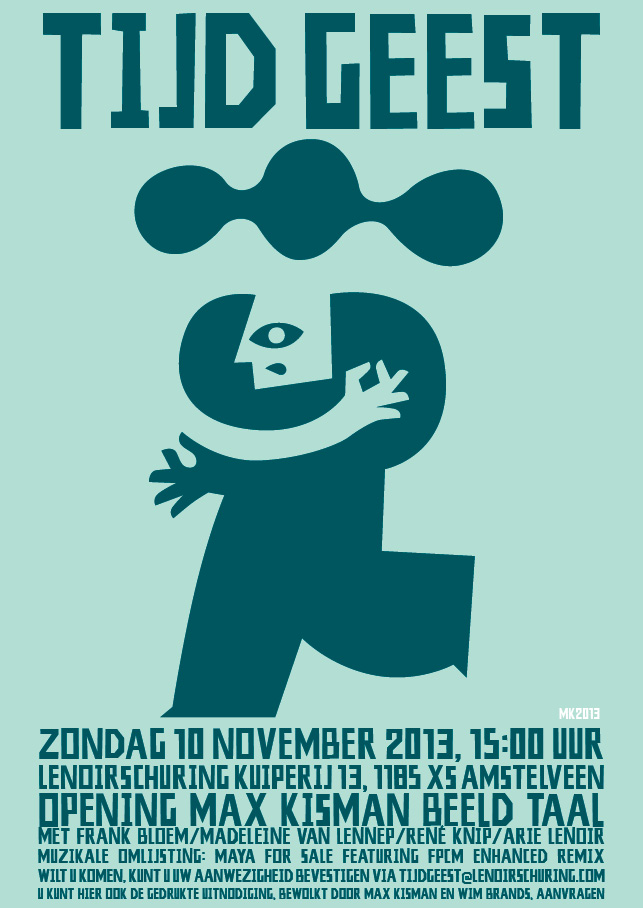
Max Kisman's Time Spirit
TIJD GEEST Lenoirschuring Kuiperij 13,
Amstelveen metro 51, halte Spinnerij, Amstelveen
At the opening of the exhibition Max Kisman discussed the motto TIJD GEEST/ZEIT GEIST and how to stay in business as a creative mind, with Frank Bloem (fine artist, co-founder of The Ferris Wheel and Frank Dean - frankbloem.nl), Madeleine van Lennep (managing director of BNO - bno.nl), René Knip (graphic designer, founder of Atelier René Knip and Gebroeders Knip - atelierreneknip.nl) and Arie Lenoir (Lenoirschuring - lenoirschuring.com).
Musical intermezzo's by Maya For Sale (mayamertens.nl) featuring fPcM Enhanced Remix (ttypp.nl)
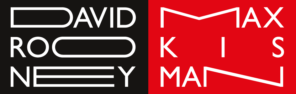
17 October, 6:30 hrs, Smock Alley Theatre, Dublin, Ireland: The IDI presents Oranje & Green #1.
Max Kisman + David Rooney.
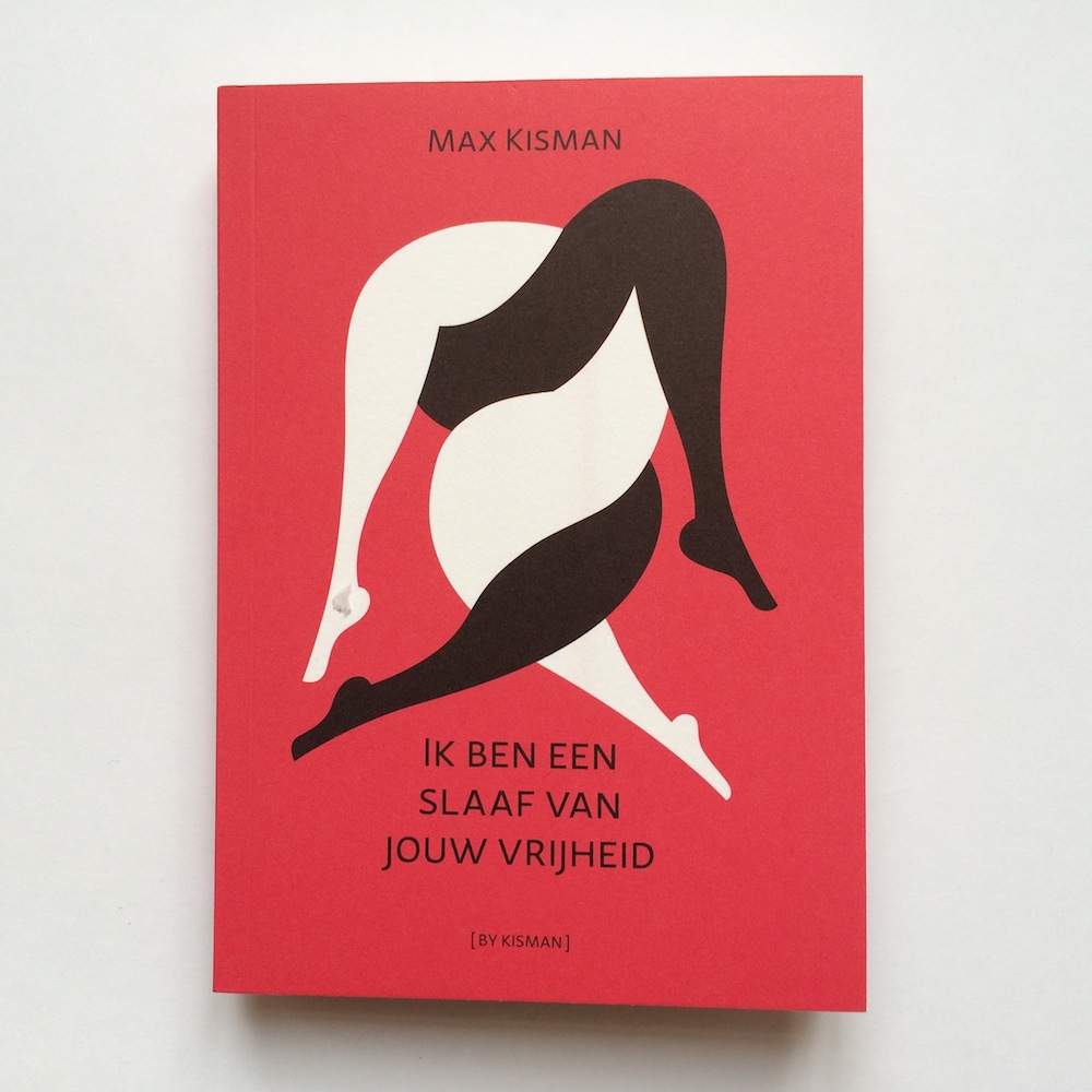
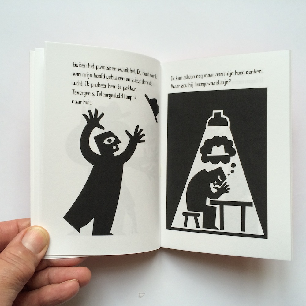
I am a slave of your freedom
(2013_0704) The recently restyled magazine De Boekenwereld released a special issue entitled "Slavery Imagined". This year marks that 150 years ago slavery was abolished in the Dutch colonies. Each issue of De Boekenwereld has a poster produced by a different designer. This time the collectible is made by Max Kisman. Available at a.o. Athenaeum Nieuwscentrum, Nijhof & Lee and online through bijzonderecollecties.hexspoorwms.nl
Price € 12.50.
Max Kisman te gast bij Jelie Brouwer van Kunststof Radio 1, maandag 25 maart 2013. Hij tovert met beelden en knutselt met taal. Max Kisman wijst ons de weg op Schiphol, beïnvloedt onze openbare ruimte en de beelden die we via televisie en krant binnenkrijgen. Nu is er een overzicht van hem te zien in het GR-ID in Groningen. Beluister het interview met Jellie Brouwer.
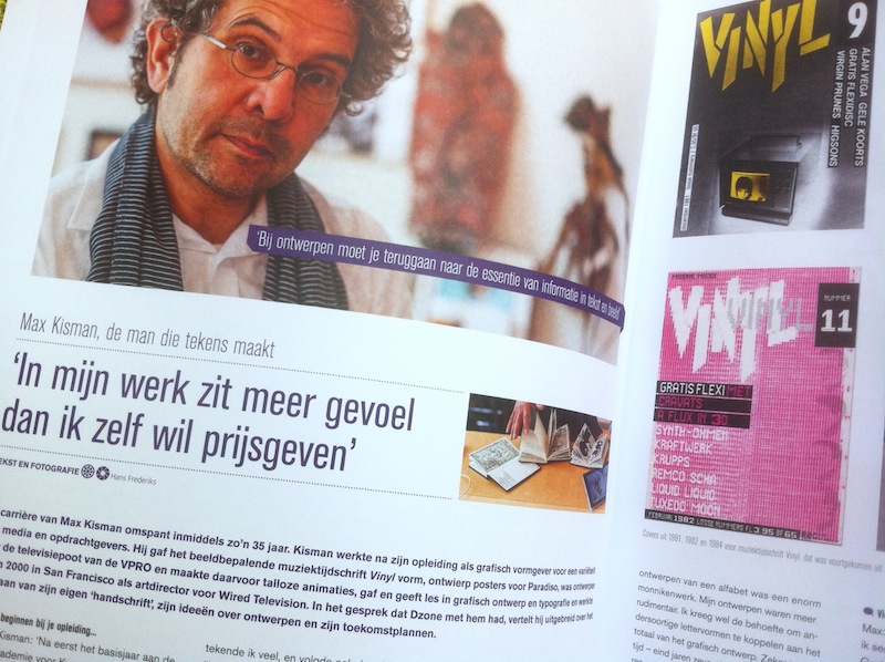
Kisman, de man die tekens maakt. Interview in DZONE available as PDF (NL)
(2013_0305) With his kind permission, the interview of Hans Frederiks with me is now available as a PDF from my website. However, the interview is in Dutch. Max Kisman, the man who makes signs: “There is more sensitivity in my work than I would like to reveal.” In this interview Max Kisman talks about his thirty-five years career and how his distinguished signature style creeped into his work as an typographer and illustrato. More information on Dzone: DZONE, vakblad voor designers #142.
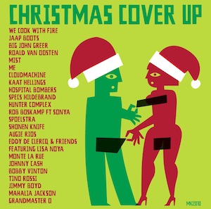
Christmas Cover Up!
(2010_1129) It was fun designing this very attractive and pleasant Christmas album with covers and originals of known and obscure Christmas songs. The CD is compiled by Oscar Smit and released by Sonic Scenery. When Oscar asked me to design the inlay booklet, disk label and inlay card, the idea of a cover cd made me think of covering up nakedness. When I placed Santa hats on the naked couple, also the title of the CD was born. Buy from bol.com, free recordshop, download iTunes and Juno. More info on myspace.com/christmascoverup.
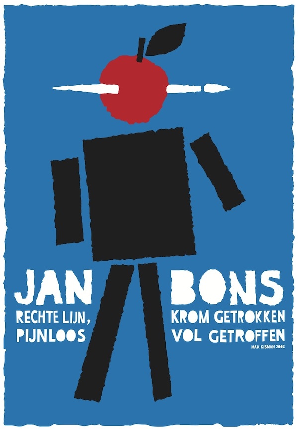
Jan Bons dies at 94 Graphic designer and artist Jan Bons died at the age of 94 in Amsterdam last week. To me he was one of the greatest inspirators in perfection of simplicity – "Straight line, warped. Painless full hit." Lees meer op Items.nl (Dutch) >>
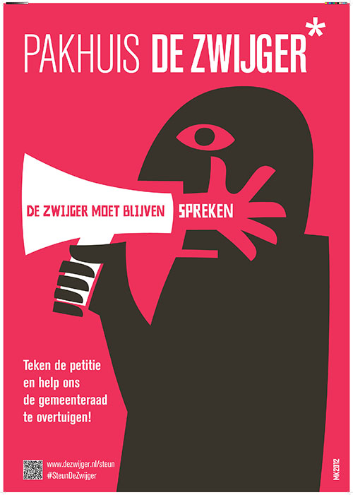
The Silent must continue to speak
(2012_1002) Support the petition and help to convince the city council to maintain warehouse De Zwijger. This image, origianally a visual comment in Illustration Daily, has been picked up for the campaign to save creative hotspot De Zwijger.
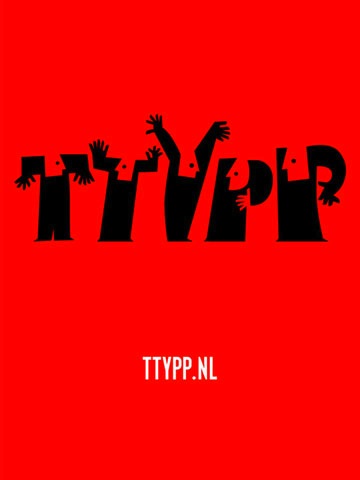
Tea Tae Why Pea Pea
(2012_0430) The TTYPP 26x26" app is the first app/e-publication of TYP. This special financial issue contains cotributions in words, image and sound of: Jacques Koeweiden, Ronald Ophuis, Ron van Roon, Donald Beekman, Henri Lucas, Atte Jongstra, Kees Maas, Jan de Jong, Caroline de Lint, Willem Sjoerd van Vliet, Dick Tuinder, Ko Sliggers, Joost Verhaak, Jan Dietvorst, Joke Mestdagh & Anke Broeren, Dennis Duchhart, Hansje van Halem, Peter Jonker, Olga Scholten, Alex Slagter, Peter Mertens, Jona Rotting, Dirk Vis, Roosje Klap, Fran van der Hoeven and Max Kisman. Release date: december 2011.
Get the app for €0,79 in the iTunes App Store
For more information visit ttypp.nl/app
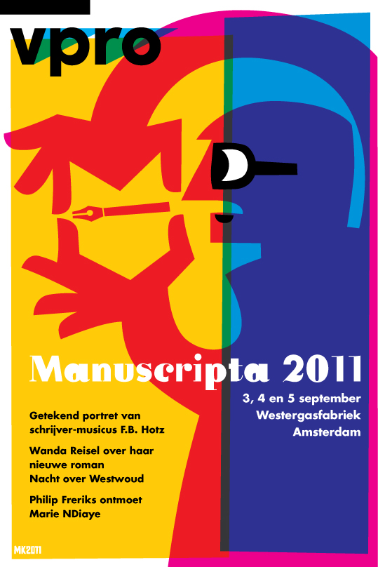
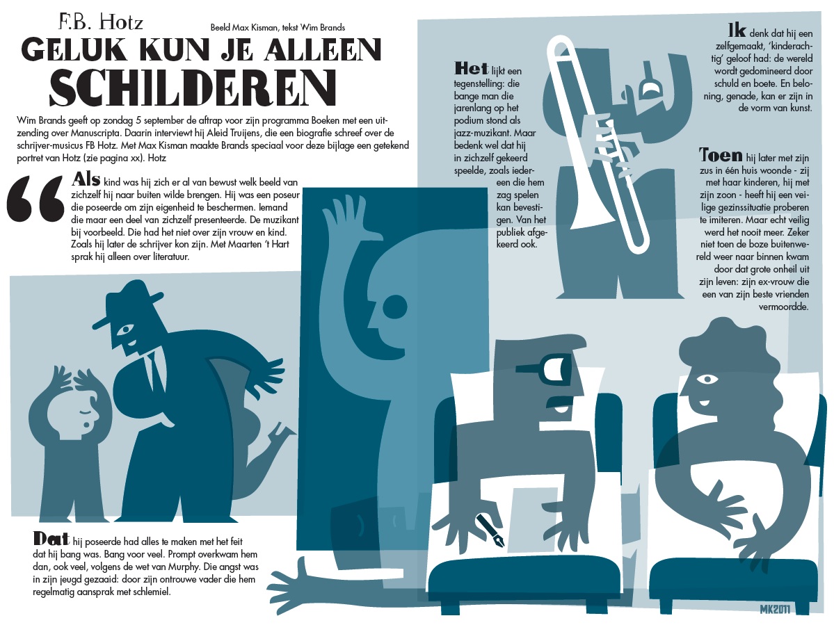
Illustrated interview
(2011_0824) Wim Brands conducted and interview with Aleid Truijens on Dutch author F.B.Hotz. A four page illustrated interview appears in the last August issue of the VPRO TV guide.
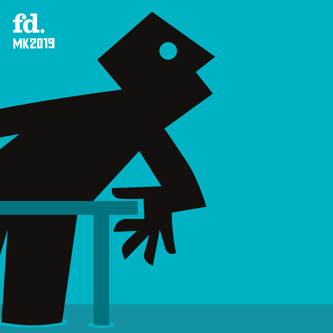
Animated illustrations for Financieele Dablad (2019_0818) Currently adding animated version from newspaper illustrations to the digital platforms of the Dutch financial newspaper FD.
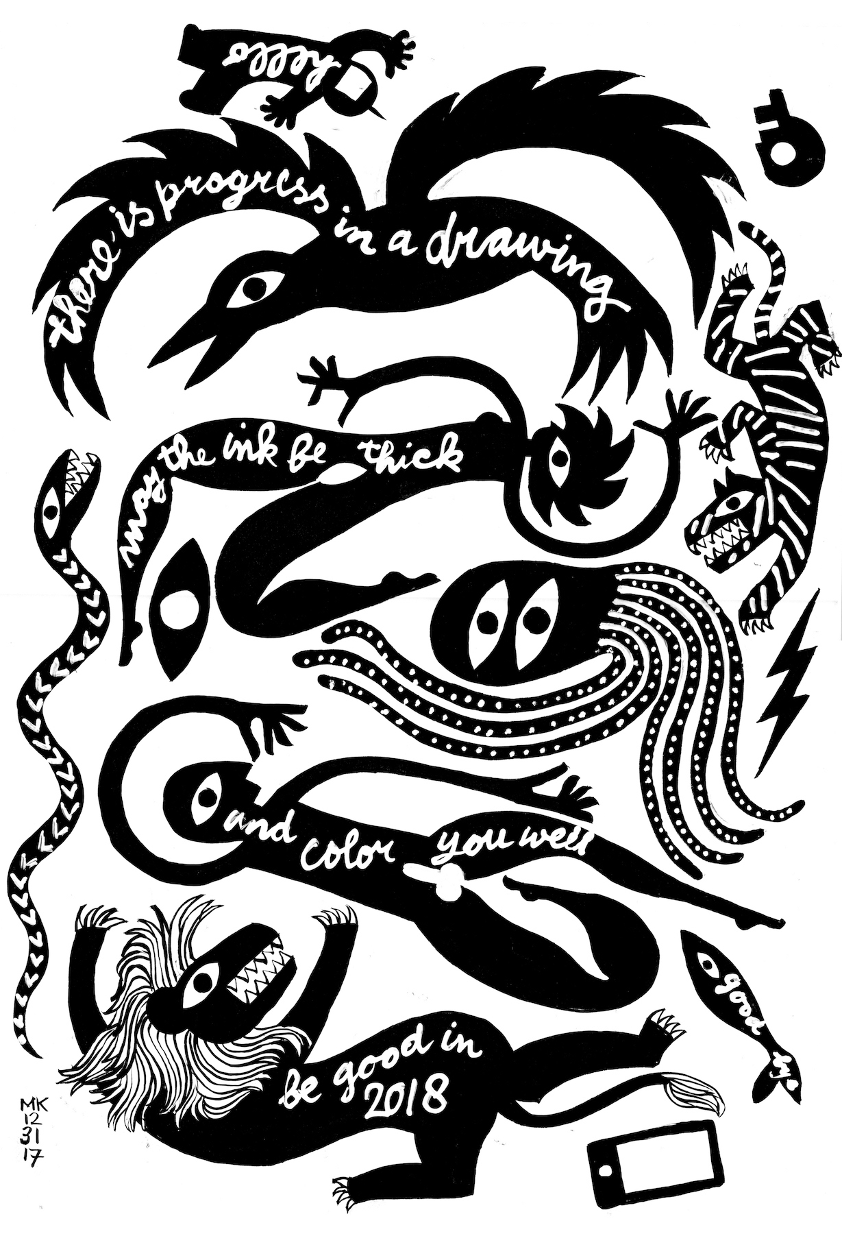
be good in #2018
(2017_1231) there is progress in a drawing – may the ink be thick – and color you well – be good in – #2018
Pixels & Paper
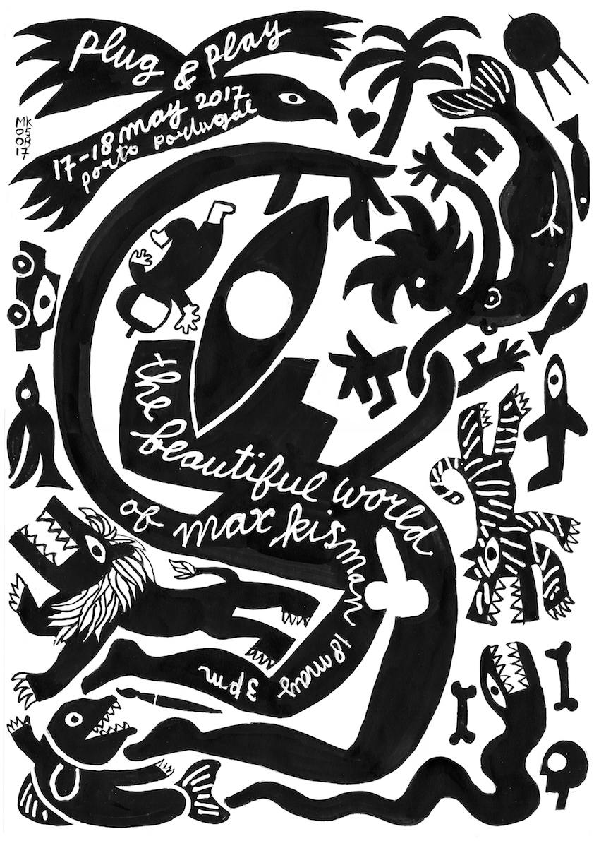
(2017_0825) Screenprint for Pixeils & Paper presentation at BNO Utrecht/Sensorlab on 12 September 2017. Available at the event for €15 and at bykisman.com Plug & Play (2017_0519) For my Plug and Play (Oporto, Portugal) presentation I created this A3 on 40x50 cmscreenprint. Limited edition of 39 copies. A few still available at bykisman.com for €15 (excl. shipping & handling)
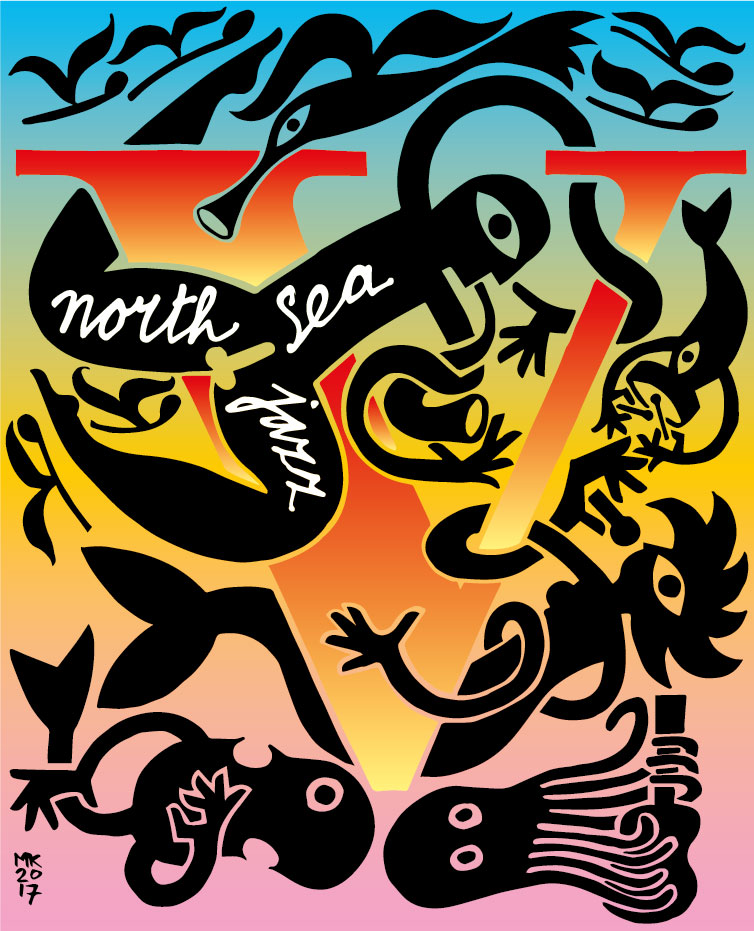
North Sea Jazz (2017_0707) Cover drawing for Volkskrant V on the North Sea Jazz Festival 2017
The Beautiful World (2017_0413) The poster for the lecture The Beautiful World of Max Kisman on 14 October 2016 at Artez, Zwolle has been nominated in the Chaumont poster competition 2017. Wonderful!
#KismanMaxTour (cont'd):
Fiep Westendorp en Max Kisman: Voor altijd jong 17/9-30/10 WG Kunst Amsterdam
(2016_0621) In 2016, Fiep Westendorp - the creator of Jip and Janneke - would have become 100 years. For the children’s book week (5 - 16 October, theme grandfathers and grandmothers) the iconic images of Fiep will be shown at WG Kunst in Amsterdam. Max Kisman takes a significant part in the exhibition with an installation: how would Jip and Janneke look like if they would be an aged grandfather and grandmother. There also will be a wall-filling wallpaper with the work of Fiep Westendorp and Max Kisman. WG Kunst, Amsterdam 17 september - 30 October
Max Kisman in Hall of Fame of ADCN
(2016_0211) Two top creatives have been inducted into the ADCN Hall of Fame this year: Max Kisman (Kismanstudio) and Mervyn ten Dam (ACHTUNG!). Both of them personally received the award and were interviewed about their work by ADCN president Lode Schaeffer and ADCN board member Richard van der Laken. Max explained the way in which he was inspired by MTV in the early eighties: ‘Having seen pixelated and computer modified video clips I realized that the impact of digital technology would also hit graphic design. This influenced my early work profoundly’.
Kisman talks and shops
Prague & Pilzen 2-3/12/2015 (2015_1111) In design, the creative process is working with limitations, while getting the most out of it. With many assignments there is always the limited budget, the lack of time, bad planning, and often a lack of imagination or intelligence of companies. Yet the artists own limitations and impossibilities are his best assets. Stick to your self, it makes you stand out. I will be talking about this in the De.sign lecture series on at Instituto Cervantes de Praga and the design department of the university in Pilzen.
Kisman talks at Inkfest (2015_0308) Short presentation on the influence of Javanese Wayang Kulit on my visual language. InkFest, Sunday 12 April 2015, De Hallen, Amsterdam.
InkFest 2015 takes place in the Passage of the ‘Hallen’ in Amsterdam West (near the Ten Kate market) from10.00 to 17.00 hrs. Admission is free. A special program starts at 13.00 hrs in the Belcampo room, featuring: Gielijn Escher, Isabel Lucena (Portugal, Wilfried Huet, Wim Jansen, Max Kisman (ancestral influences), Flip Ekkers (Philip Elchers publishers), Jeannette Dekeukeleire and Harry Ruhé (Cult Club), Esther Gasseling and Frits Jonker of (Xtra publishers and Showcase) and Betty Race Palatti.
Slaaf van jouw vrijheid (2015_0118) ‘I am a slave of your freedom’ includes the short cartoons ‘The lost hat that was found again’ and ‘The shadow of your smile.’ The third story ‘I came by boat’ is the description of the triptych ‘Ancestral Migration’ in three scenes: ‘The lost kingdom‘, ‘The symmetry of life’ and ‘Sons and heirs’. The first edition of 75 copies in Dutch and 75 copies in English. 48 pages, published by and available in Dutch and English at By Kisman, bykisman.com
FD.nl: Time reader (from 2014_05 on) Weekly vignette to Time Reader column on Saturday by Joost Steins Bisschop in Het Financieele dagblad has animated version on the website FD.nl. Animated by Abel Kisman.
(2014_0102) Niet geschoten, altijd mis... Nothing ventured, nothing gained. Wishing you good aims in 2014.
De Grote Amsterdamse Kunst Kalender
(2013_1101) My contribution to the Big Amsterdam Art Calendar. To be presented Saturday 1 November. More info here or here FB event
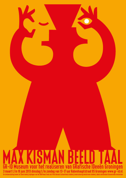
Max Kisman Beeld Taal
3/3-16/6 June 2013 GR-ID Groningen
(2013_0208) Graphic designer and illustrator Max Kisman (1953) enchants with images and plays with language. Although experiments with personal computers in the eighties yielded him the reputation of digital pioneer, his work is widely oriented. He designs magazines, television sets and programme leaders, typefaces, websites and sound logos, illustrates, lectures and publishes for clients at home and abroad.
Kisman's idiosyncratic imagery is characterized by powerful simplicity: he reduces with his “complexity of simplicity” substance and meaning to its most elementary form. His work fits in well with the Dutch design practice, but also shows a strong affinity with the tradition of Javanese shadow puppets. Thread for inspiration is the question how image relates to language and language is related to image. To what results this leads will be shown in the exhibition Max Kisman Image Word in GR-ID - Museum for realizing GRaphical IDeas (formerly Graphic Museum Groningen).
Max Kisman Image Word from 3 March until 16 June 2013. Tuesday to Sunday from 13.00 to 17.00 hrs. GR-ID Rabenhauptstraat 65 9725 CC Groningen NL
050-5256497 www.gr-id.nl
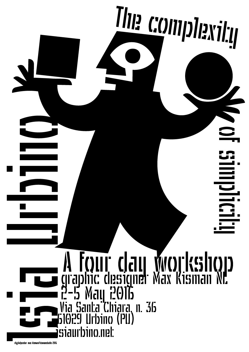
Complexity of Simplicity tour Max Kisman appears: September: Graphics Work at Lenoirschuring, Amstelveen 10 March: Knippen als Kisman (Cutting like Kisman). Kids workshop in Stedelijk Museum Amsterdam March-June: Several tours, lectures or workshops related to the Max Kisman Beeld Taal exhibition, Groningen. Check www.gr-id.nl for info and dates. 20 December: Illustration art for digital media. Brands and Kisman's IJsseloever App goes ARTEZ Zwolle, 16.00 hrs.
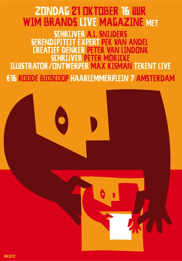
8 November: Introducing graphic designer Niklaus Troxler at his poster show, 19.00 hrs, North Sea Jazz Club, Westergasfabriek, Amsterdam. More >> 6 November: Guest in What's Up, 20.00 hrs, Pakhuis de Zwijger, Amsterdam, entrance free w/ registration 21 October: Guest (live drawing) in Red Sunday, life literary magazine by Wim Brands. 16.00 hrs, Roode Bioscoop, Haarlemmerplein 7, Amsterdam, entr €16
5, 22 October, 5 November: “A Letter Can Be Anything” workshop at the Design Academy, Eindhoven 4 October:“Innovation and tradition”, Academy St. Joost, 's Hertogenbosch.
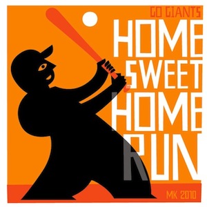
(2010_1102) SF Giants play Texas Rangers competing in the World Series and have won in a 4-1 victory. Tcho gift box sleeve.Go Giants Go!
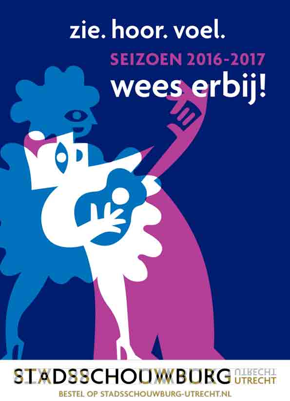
City Theatre Utrecht
(2016_0430) In collaboration with with Marieke Griffioen of Edenspiekermann, I created five theatre figures that combine in different compositions and colors for the 2016 season campaign of the Utrecht City Theatre on posters, ads, banners, flags, program guides, flyers, and narrow casting.
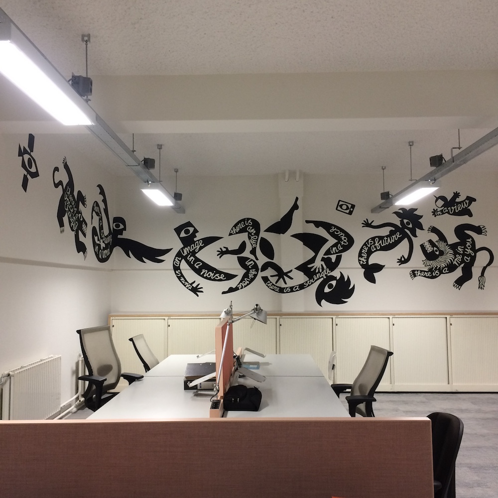
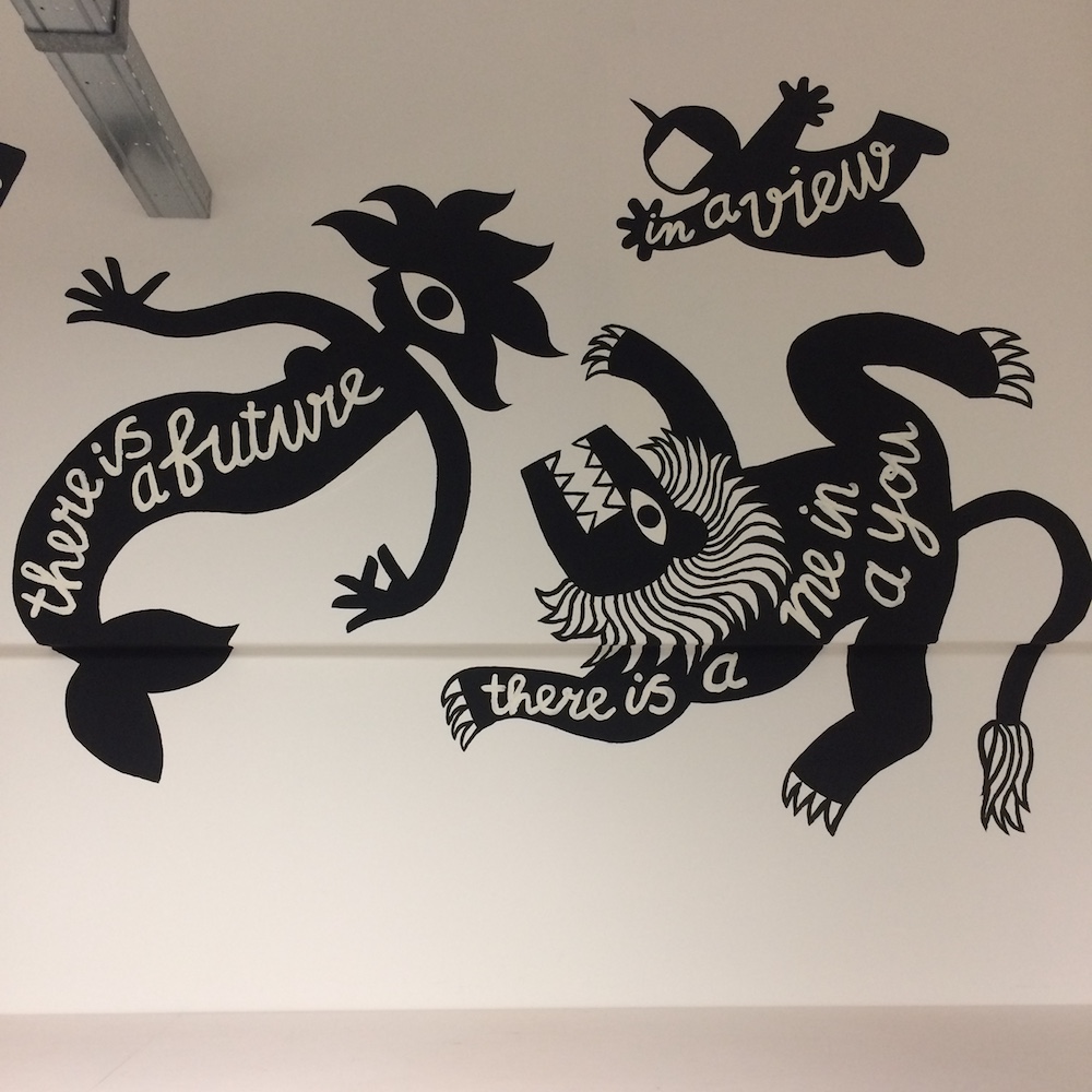
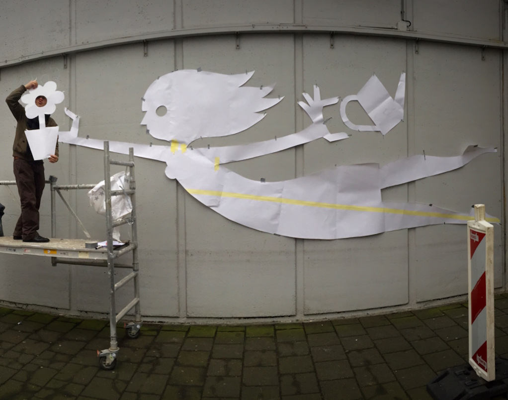
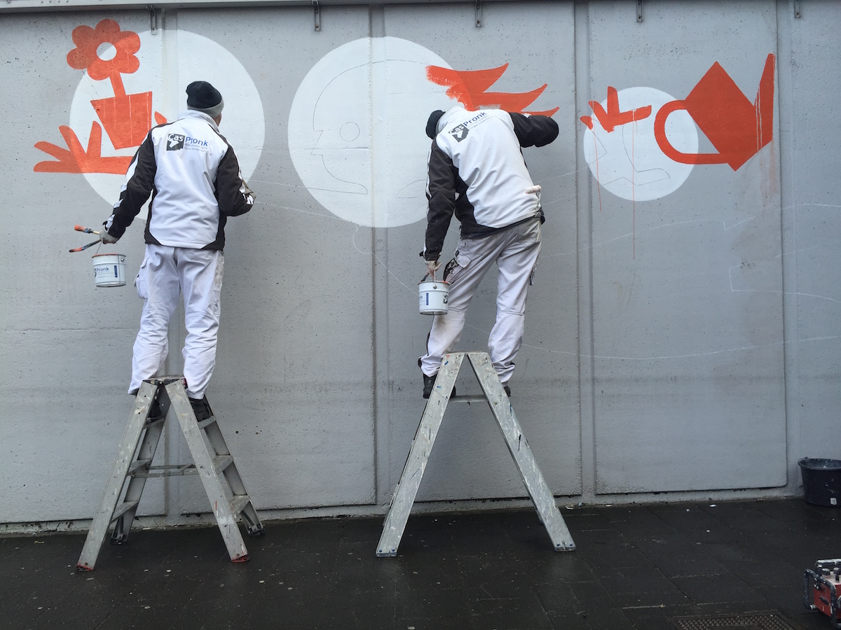
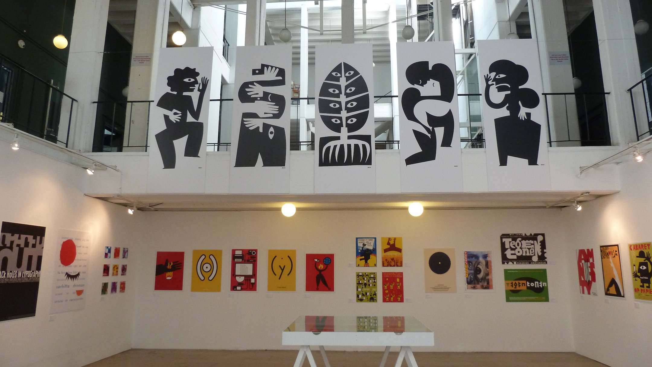
Mural for BNO Amsterdam(2018_0918) This summer, Max Kisman created a mural design for the offices of the Professional Dutch Designers Association BNO in Amsterdam. Over the weekend of 14-16 september he caftfully applied the mural of various typical Kisman slihouette figures in black with a poetic text in white.
there is a voice in a thought
there is a drawing in a word
there is an image in a noise
there is an eye in the void
there is a strength in a touch
there is a future in a view
there is a me in a you
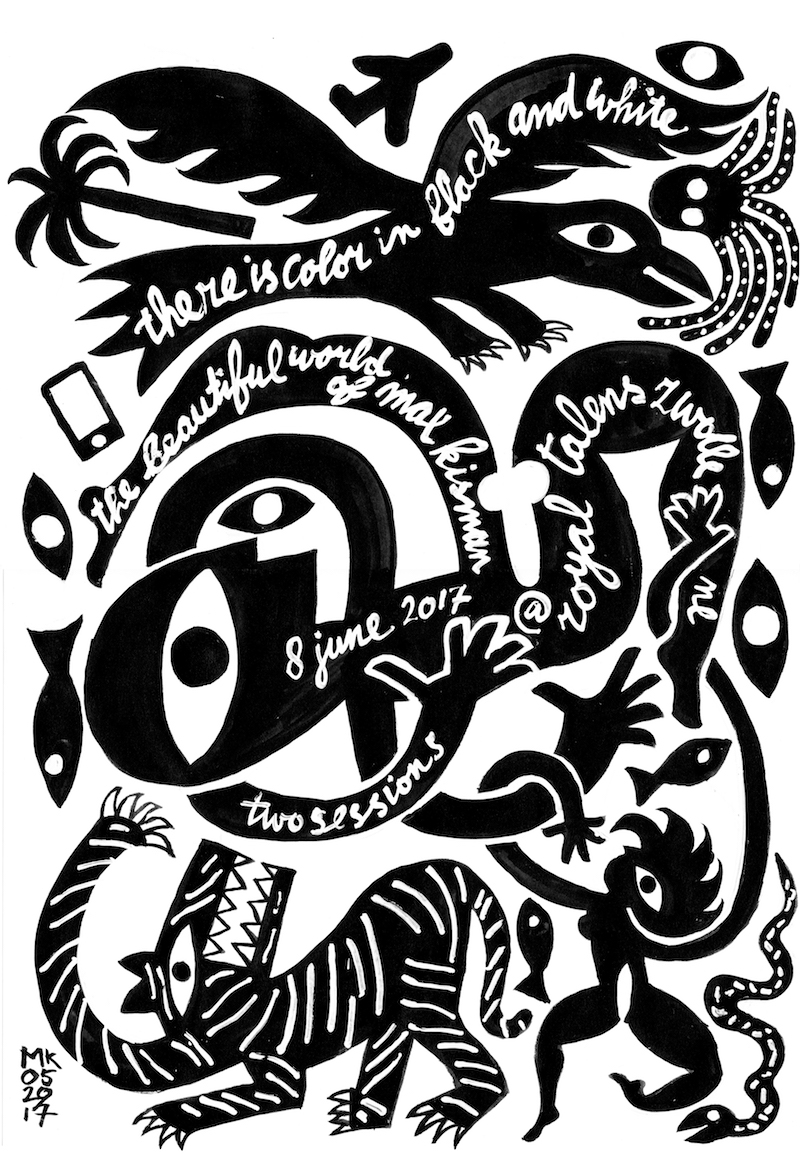
Color in black and white
(2017_0529) For my lecture at Fiep Wesyendorp for Professinals at Royal Talens in Apeldoorn NL, I will make a newA3 on 40x50 cm screenprint in a limited edition. Might print in dark red. Available at the event for €15 (excl. shipping & handling) on bykisman.com
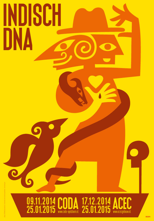
Indonesian DNA
CODA Museum 09.11.2014 - 25.01.2015 and ACEC 17.12.2014 - 25.01.2015
(2014_1001) Indisch DNA (Indionesian DNA) has its origins in the former Dutch East Indies; the country is since independence in 1949 known as Republik Indonesia. For many, this country evokes images of an impressive nature, rice fields, eastern mysticism, batik art, fairytale wayang, ancient dance rituals and Indionesian literature. More >>
Calendar cover (2017_0501) Lenoirschuring Printers publishes a quatrely calander. For the third quarted I designed these coversheets printed on very nicely differen tkinds of paper.For more information or order a copy contact Lenoirschuring.
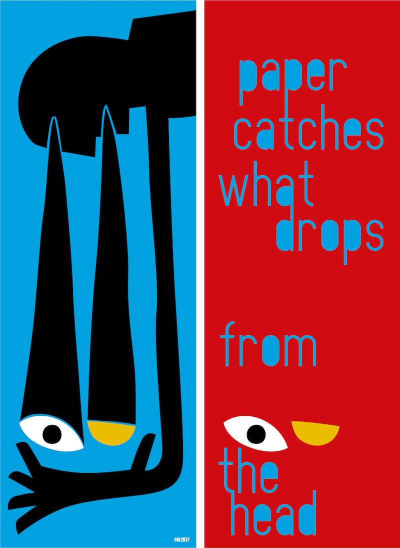
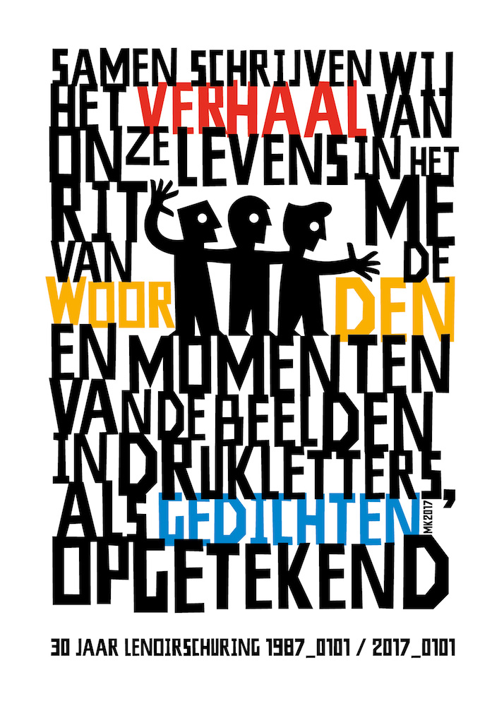
30 years Lenoirschuring (2017_0101) A commerorative print design for the 30th anniversary of Lenoirschuring Printers, Amsterdam. Together we write - the story of - our lives in the - rhythm - of the words - and moments - of the images - printed in capitals - like poems noted
Clos Saint Fiacre
Orléans 2015 (2016_0529) A beautiful wine deserves a great label. Imported by Dutch wine importer David Bolomey: Clos Saint Fiacre Orléans 2015. Available exclusively at www.bolomey.nl
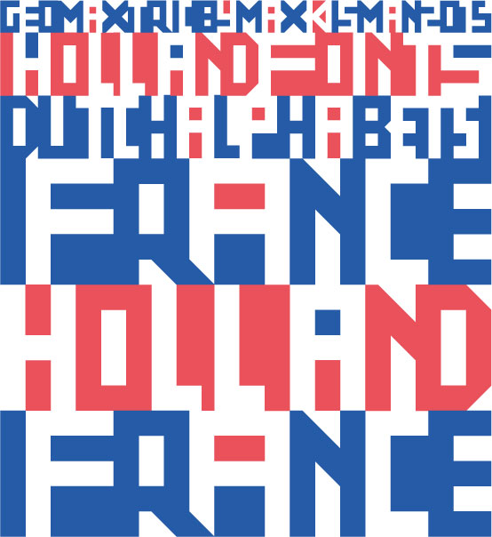
Dutch Alphabets: examples of lettering (2015_1111) Geomaxtric is the font by Max Kisman designed for Dutch Alphabets, a examples of lettering. This unique publication is edited by Peter Verheul and Matthieu Lommen and includes contributions by Yomar Augusto, Jacques le Bailly, Donald Beekman, Fransje Berserik, Barbara Bigosinska, Erik van Blokland, Maria Doreuli, James Edmondson, Ramiro Espinoza, Martina Flor, Dave Foster, Fritz Grögel, Janno Hahn, Hansje van Halem, Berton Hasebe, Ondrej Jób, Max Kisman, Holger Königsdörfer, René Knip, Paul van der Laan, Lida Lopes Cardozo, Niels Shoe Meulman, Ross Milne, Gerrit Noordzij, Diana Ovezea, Krista Radoeva, Trine Rask, Arthur Reinders Folmer, Donald Roos, Pieter van Rosmalen, Kristyan Sarkis, Florian Schick, Elmo van Slingerland, Fred Smeijers, Irina Smirnova, Teo Tuominen, Gerard Unger, Peter Verheul, Bernd Volmer, and Job Wouters. Published by the Buitenkant.
Kisman in Miffy Art Parade (2015_0308) Miffy Hug is Kisman's contribution to the 60th anniversary of nijntje (Miffy). Dick Bruna's special creature celebrates her 60th birthday. 60 artists have decorated a life size nijntje. Each day in March and April a new statue will be released on www.miffyartparade.com
What was up with... kismanstudio.nl, maxkisman.com and hollandfonts.com (2015_0118) Finally the migration of the domains have been completed, including this one. Still need to update the coms...
(2014_07207) Due to server migraition of the US provider maxkisman.com and hollandfonts.com have been off-line for quite some time. A provider switch re-established their accesibility, but they need some updating still.
Font Aid VII: The Philippines
(2013_1221) Over 275 designers from 46 countries contributed glyphs to the project with the goal of creating a typeface consisting of images based on the eight-rayed sun from the Philippine flag.
Font Aid is a charitable endeavor. We wish to ensure that we provide the maximum support possible to the people and organization that need it. Any work submitted to a Font Aid project will be deemed a charitable gift and a work made for hire. Whenever possible, we are happy to credit the creativity of the participating designers.
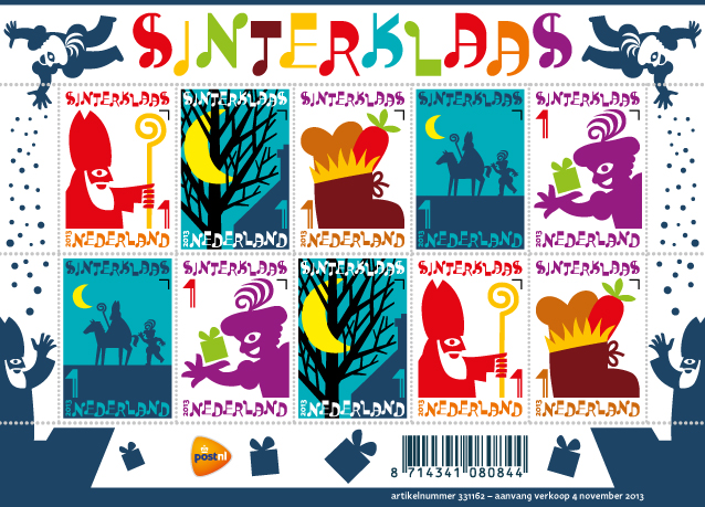
(2013_1102) The annual Dutch celebration of Saint Nicholas stands for joy and expectation. The Sinterklaas sheet of stamps expresses exactly that atmosphere. The five illustrations and designs by Max Kisman in ten stamps are based on the classic Saint Nicholas story. More info at PostNL.nl and Postzegeblog.nl (Dutch).
A beautiful summer throws
a soft shadow
(2013_0621) This is the third card in a series of six that I will make during 2013 for Jubels printers in Amsterdam, NL
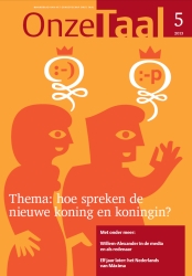
Covers Onze Taal
(2013_0430) The language of our new king and queen in Onze Taal magazine (Dutch).
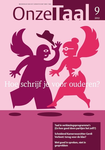
(2012_0902) Last month I made this cover image on writing and adressing seniors with a specific ligual approach. Words that give wings. Onze Taal magazine (Dutch).
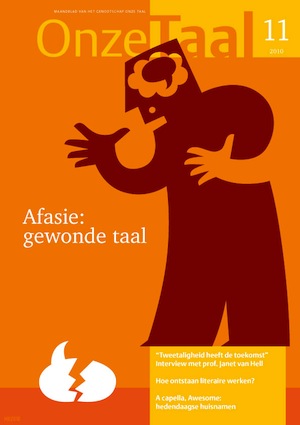
(2010_1101) Aphasia is the theme of the November issue of Onze Taal magazine (Dutch).
Bits to Pieces
(2011_0911) Now updated with interviews on digital archiving with Piet Schreuders and Max Kisman. www.bits-to-pieces.org
(2011_1004) The Bits to Pieces project of Dutch art historian Karin van der Heiden investigates the rise of the digital revolution, the experiences of the early adapters in digital graphic design and the digital heritage of the 80s. The process of preserving digital records begins with their creation. We need pragmatic strategies that enable us to preserve digital born material. Kismanstudio logo and website design.
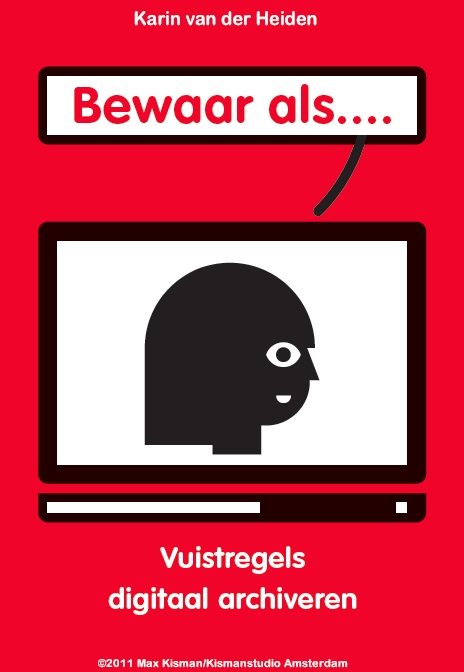
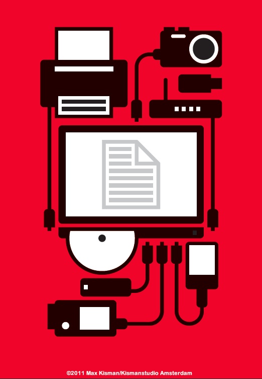
(2011_0901) I am currently designing the Dutch version of Save as.... This concise guide to digital archiving is wriiten by art and historian and design heritage expert Karin van der Heiden. In a 16 page leporello you get essential guidelines in sustainable digital preservation of your digital work. Soon to be published in the Netherlands. The English version is being prepared.
(2011_0901)Digital archiving is not the same as making a back up! Selection is necessary. Not everything is important and need to be preserved eternity.
Broken Language image on november issue Onze Taal
Gold Award for design City One Minutes website
(2010_0601) The City One Minutes website has won A gold European Design Award at the European Design Festival in De Doelen in Rotterdam. The design of the website is by graphic designer Max Kisman and implemented by design agency Fabrique and Studio Stomp. The annual awards are given to European designers that have made exceptional designs in the field of communications.
On www.cityoneminutes.org artists have recorded life in more than one hundred cities across the world from hour to hour movies in one minute. C.O.M. is a project of Holland Doc 24/VPRO in collaboration with The One Minutes Foundation.
Holland Doc 24 identity
Holland Doc 24's new identity was launched Thursday 12 November 2009 on their website and on the digital channel Holland Doc 24
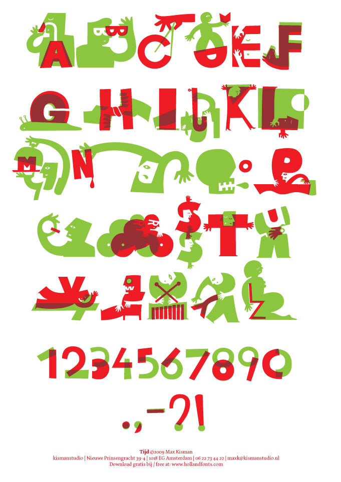
Small Dictionary about Time
Illustrations turn into typeface TIJD (Time) alphabet is extracted from 26 illustrations I made for Vouwblad 7: Klein Woordenboek over Tijd (Folder 7: Small Dictionairy about Time), issued in fall 2009 by Lenoirschuring Printers in Amstelveen, the Netherlands. The font and poster PDF are free available from Holland Fonts
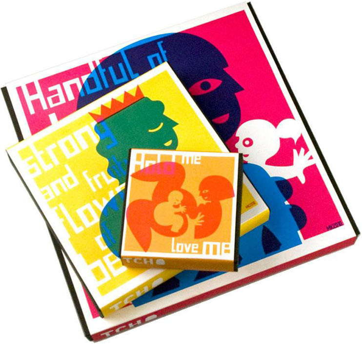
Tcho artist-series with
Max Kisman
(2010_0210) My graphics feature on Tcho's 2010 holiday chocolate boxes with bright vibrant colors, iconographic imagery, and special typography. Valentine's day, Easter, MothersDay, Haloween, Thanksgiving and Christmas. Visit Tcho.com in San Francisco, California.
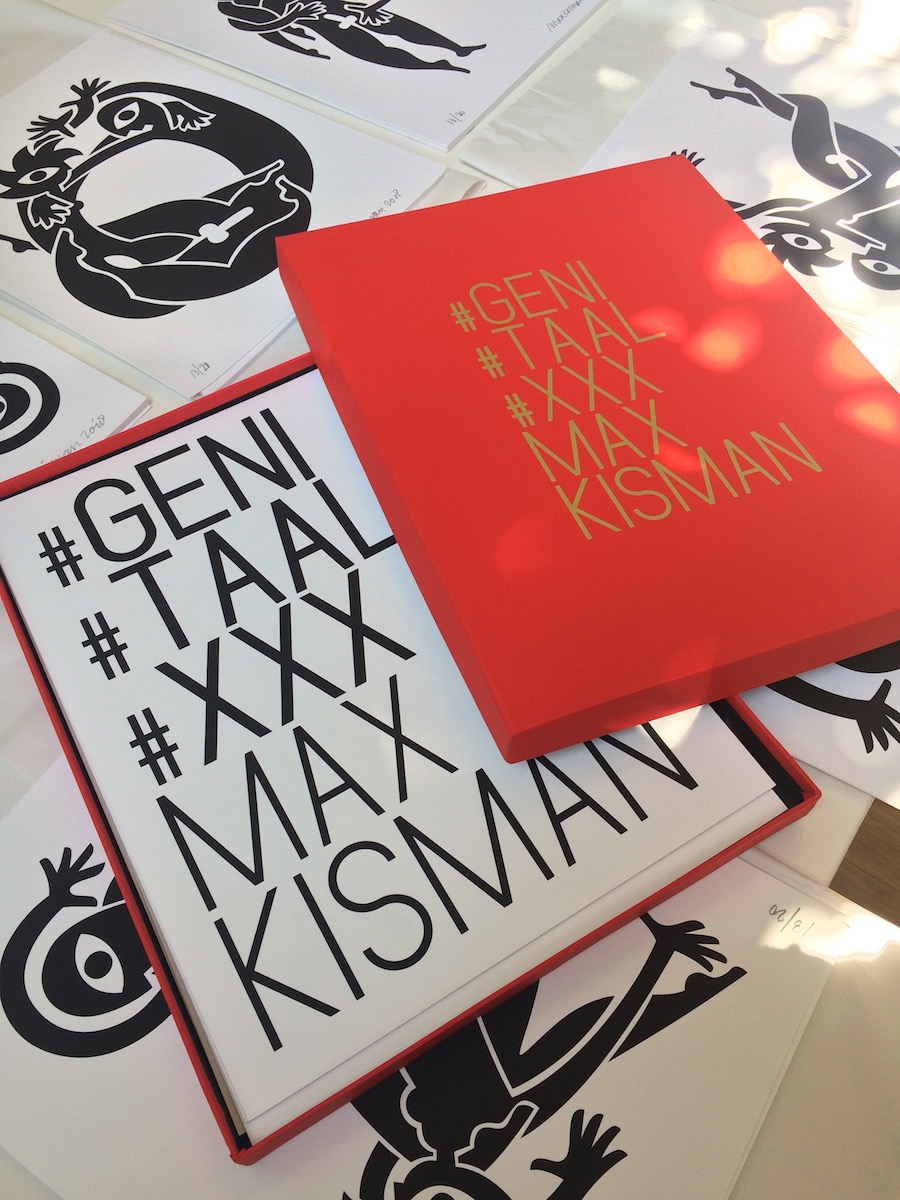
#Geni #Tales deluxe box (2018_0420) Today I collecting the 26 numbered and signed screenprint plus 4 text pages of the complete Max Kisman Geni-tales alphabet. Soon available in limited edition of 20 deluxe red boxes with golden type print. Available at bykisman.com
#Geni #Tales #XXX
(2017_0930) Currently working on #Geni #Tales #XXX, an erotic alphabet and erratic dictionary. To be published on 11 november at the Art Book Fair in the St. Pieterskerk in Leiden NL. Published by Drukwerk In De Marge.
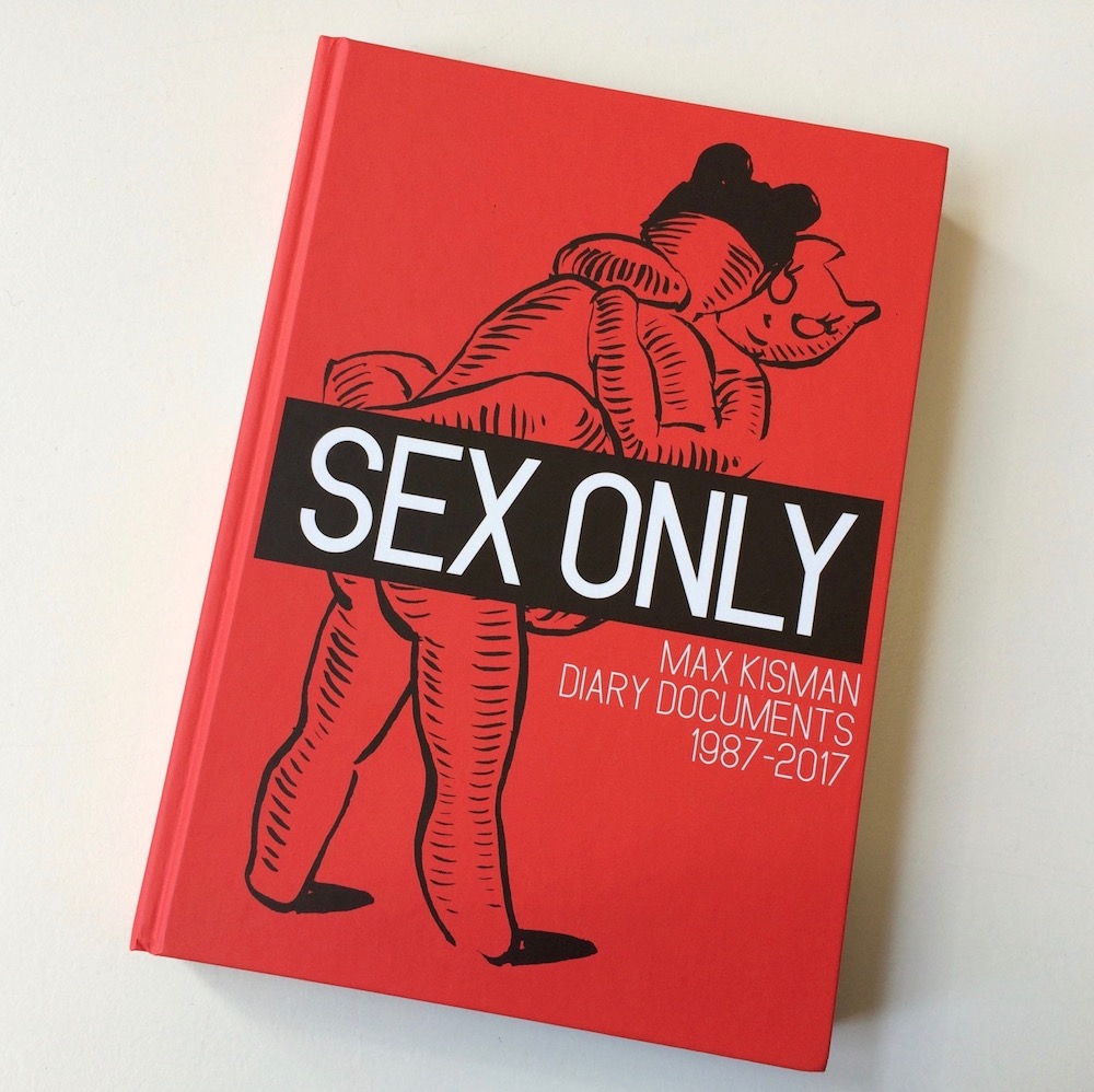
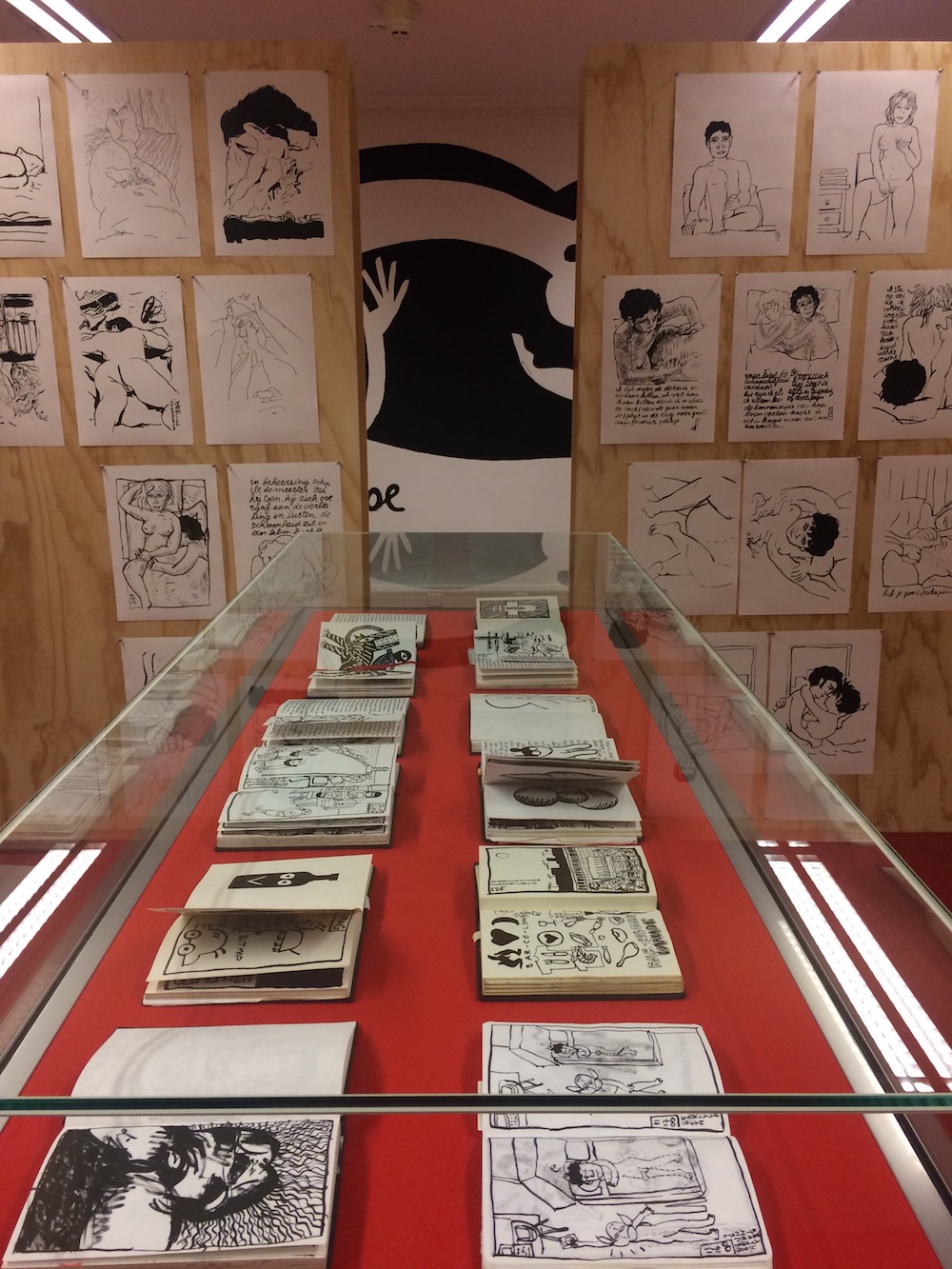
Sex Only book & exhibition
(2018_0418) ‘SEX ONLY – Diary Documents 1987-2017’ consists of a small selection from 20,000 diary drawings. The thread in the selection is the desire for physical interaction and emotional affinity. SEX ONLY shows how desire, lust and pleasure are an initiator for imagination. In the exhibition enlarged diary drawings are supplemented with display cases with original sketchbooks and unique murals. Showing clearly which role sex plays in life; it is the driving force to keep moving and to create.
On 8 April 2018 Kisman’s book ‘SEX ONLY – Diary Documents 1987-2017’ was presented at the opening of the exhibition with the same title in the Museum Meermanno/House of the book in The Hague. AGI president and graphic designer Nikki Gonnissen did open the exhibition and Kisman performed with life painting of one of the murals.
Book (Dutch/English)
Max Kisman – SEX ONLY, Diary Documents 1987-2017, SubQ Publishers. 240 pages, hardcover, 16x22 cm. ISBN: 9789021409498. € 24,50. Available at bykisman.com
Exhibition (Dutch, partly English)
Max Kisman – SEX ONLY, Dagboektekeningen 1987-2017, Museum Meermanno, Den Haag. 10 April - 10 Juni 2018. www.meermanno.nl
(2017_0930) For an upcoming blog series on the effect of digitazion on society Max Kisman illustrates various entries by leading opinators.
The Rathenau Instituut stimulates public and political opinion forming on social aspects of science and technology. We perform research and organise debate relating to science, innovation and new technologies
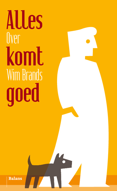
Alles komt goed (2017_0315) Op 4 april 2016 maakte dichter en VPRO-programmamaker Wim Brands (1959) een einde aan zijn leven. Hij liet vele honderden gedichten na en uren radio en televisie, voor het merendeel gewijd aan schrijvers en boeken. De laatste elf jaar van zijn leven presenteerde Brands elke zondagochtend het programma VPRO Boeken.
In Alles komt goed zien we Brands door de ogen van zijn vrienden, zijn collega’s, de schrijvers die hij interviewde en de dichters die zich met hem verwant voelden.
Met bijdragen van: Asis Aynan, Roel Bentz van den Berg, Erik Bindervoet, Annemieke Gerrist, Arnon Grunberg, Erik Jan Harmens, Judith Herzberg, Max Kisman, David Kleijwegt, Ariejan Korteweg, Erik Lindne, Maaike Meijer, Jeroen van Kan, K. Michel, Wim Noordhoek, Ester Naomi Perquin, Rob Rieme, F. Starik, Arie Storm, Thomas Verbogt, Maarten Westerveen, Maartje Wortel. Binnenkort bij uitgeverij Balans https://www.uitgeverijbalans.nl
Een monumentje voor Wim (2017_0315) Een avond op 6 april in de Rode Hoed te Amsterdam over journalist, presentator, dichter Wim Brands (1959 - 2016). Op deze avond worden ook zijn Verzamelde Gedichten (uitgeverij van Oorschot) en een kleine biografie door zijn vrienden Alles Komt Goed (uitgeverij Balans) gepresenteerd. Ariejan Korteweg, Jeroen van Kan, Ellen Jens en Thomas Verbogt vertellen over Wim als vriend, als dichter en als journalist. K. Michel, Annemieke Gerrist en Kira Wuck schreven gedichten voor hem. Leonie Jansen en Beatrice van der Poel zingen zijn poëzie. Maarten Westerveen is de presentator.
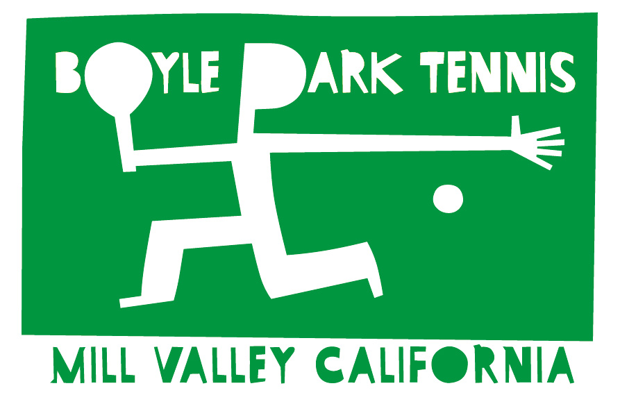
Boyle Park Tennis (2016_0529) One of my favourite logo's I did about ten years ago for the public tennis courts in Mill Valley, CA: Boyle Park Tennis...
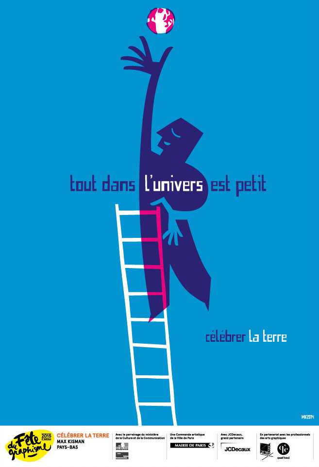
Fête de Graphisme 2015
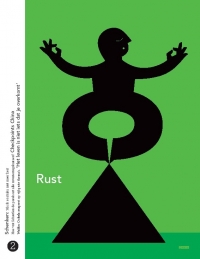
(2015_0318) In January 2015 I participated in the street show ‘Celebrate the earth’ in the annual event of the ‘Fête de Graphisme’ in Paris with the poster ‘Everything in the universe is small’. www.fetedugraphisme.org
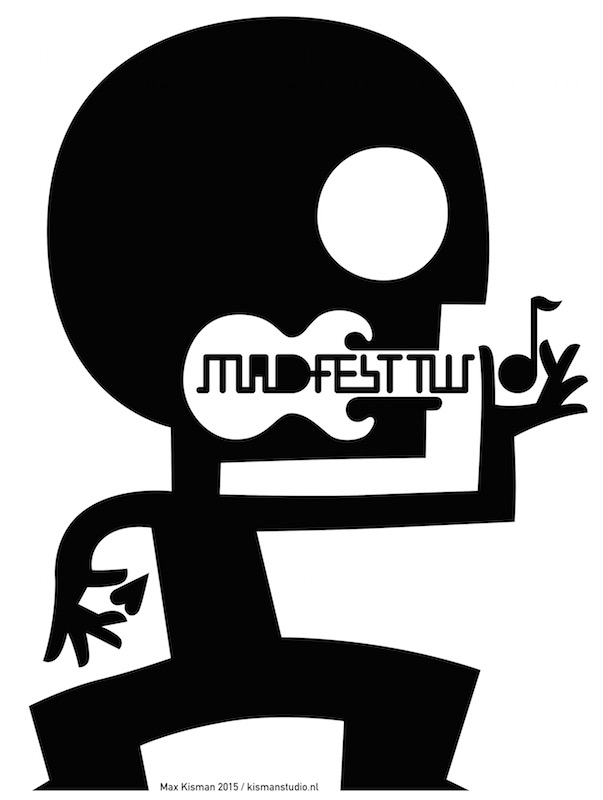
Kisman op MAD Fest 2015 (2015_0110) MAD Fest is een nieuw nationaal event bij het Burgerweeshuis in Deventer waar alles draait om de viering van creativiteit op het gebied van Music, Art en Design. Met o.a. The Diamond Exchange met Henk Koorn (Hallo Venray) en Melle de Boer (Smutfish, John Dear Mowing Club), NNENN, Paceshifters, Ben Newman (Britse illustrator), Flip Scipio (gitaarbouwer) en Martin Pyper (beeldontwerper), Jeroen Diepenmaat (beeldend kunstenaar), Paulusma (singer-songwriter/ex-Daryll Ann, Workshop Zeefdrukken (met o.a. ontwerp van Max Kisman en Ben Newman), Max Kisman (grafisch ontwerper en BNO-lid en David Carson (grafisch topontwerper). Meer op madfest.nl
Max Kisman at AGI Open São Paulo 2014 This introduction movie is a one take shot video from my current work space. AGI Open São Paulo 2014 - Max Kisman from AGI on Vimeo.
(2014_0813) My talk at AGI Open 2014 in São Paulo, Brazil will be about Ancestral Migration.
More on AGI Open here.
Typographic Matchmaking in the City: The movie
By Jan de Bruin and Ans Kanen. Featuring: Max Kisman (NL), Naji El Mir (Lebanon/F), Hisham Youssef (Egypt/UAE), Rene Knip (NL), Khajag (KJ) Apelian (Lebanon/NL), Jeroen van Erp (NL), Reza Abedini (Iran/NL), Erik van Blokland (NL), Pascal Zoghbi (Lebanon),Joumana Al Jabri (Saudi Arabia/Syria/UAE), Artur Schmal, Wael Morcos (Lebanon), Richard Wagner (D/UAE), Melle Hammer (NL), Yara Khoury (Lebanon), Stealth: Ana Dzokic (Serbia) & Marc Neelen (NL) Typographic Matchmaking in the City 2.0 from Jan de Bruin on Vimeo.
Kisman type
(2011_0901)Now in the stands! This month I appear in Publish magazine (issue 4, september 201) in Typtekens (Type signs), an interview by Henk Gianotten, with above illustration on my Pacific font, other illustrations and type designs.
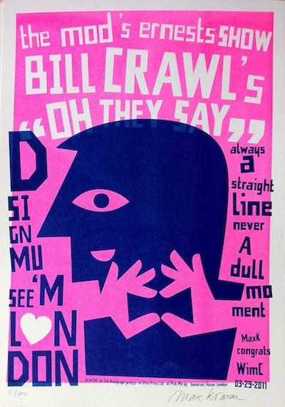
Wim Crouwel Odessey
(2011_0329>0902) Bill Crawl: “Oh they say”. This print is dedicated to the modernist Dutch graphic designer Wim Crouwel. The impressive exhibition Wim Crouwel: A Graphic Odyssee on his life time work opened on 30 March in the the Design Museum in London. The limited edition A3 Risograph is printed by Ditto Press Ltd. at the Pick Me Up graphic arts fair in Somerset House. Available for €10 at bykisman.com Kisman Kitchen: graphic identity and stage design
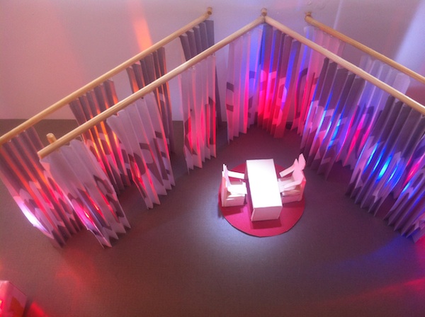
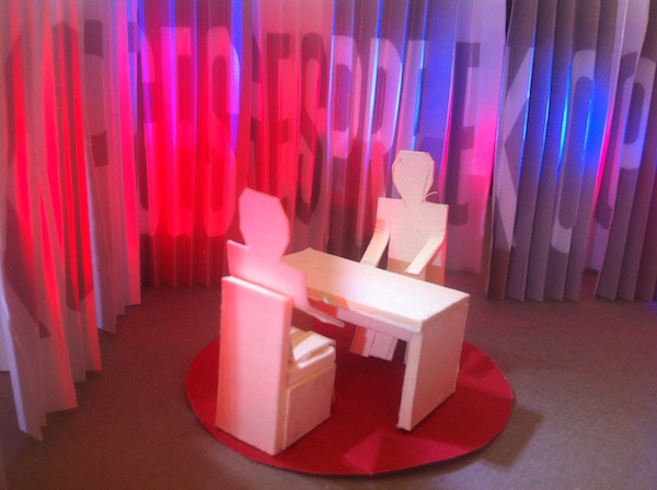
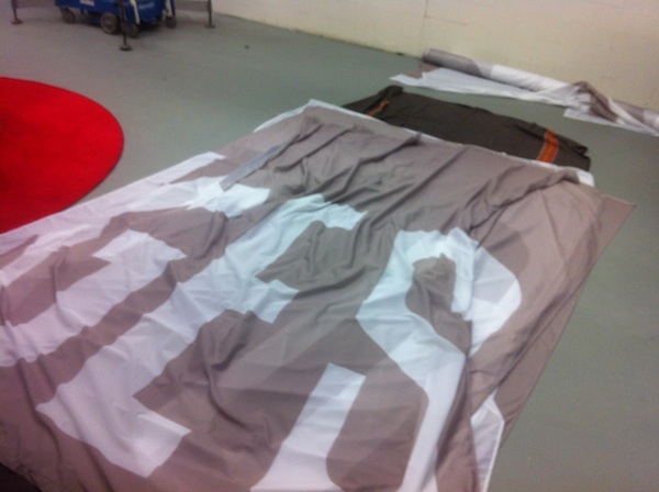
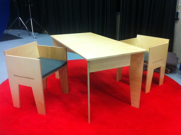
(2012_0902) For the NTR / IKON / VPRO TV program ‘Gesprek op 2’ (Talk on 2) I designed the graphics, the tune and the stage for the upcoming season. This 'less is more' stage consists oftwo rows of curtains (typographic print) a red carpet and back-to-basics furniture of my own design. Elements of the stage return in the title sequence. ‘Gesprek op 2’ conversations of Daphne Bunskoek, Paul Rosenmöller and Chris Krijne with Dutch and foreign guests link up with current affairs. The stage is still under construction; the first broadcast will be for the late nighters on Sunday 9 September at 23:30 hrs.
1:50 model of the design and stage preps:
Schretlen magazine wins gold at Grand Prix 2010 Corporate magazines
(2010_0415) After winning best cover at the Media Facts Awards in 2009, Schretlen & Co Client Magazine is gold winner of the Grand Prix Corporate magazines 2010 award for the best corporate magazine in the Netherlands, in the category external
productions.
Cover design Schretlen magazine wins award for best cover The illustration on a coverdesign for Schretlen magazine by Jacob Mulder of Amsterdam based Scripta Media is awarde for the Media Facts Award in the catagory client magazines.
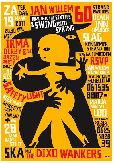
Dixo W are pulling it off...
(2011_0318) For the occasion of the birthday of one of its members the infamous Dutch Ska band Dixo Wankers (including yours truly) have played again. The band released 3 singles in 1980-1981, had several TV performances and toured the national circuit.
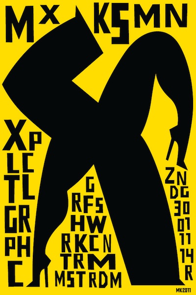
(2011_0202) On Sunday 30 January, 14.00 hrs, I spoke about what is explicitly Graphic of my work at the Grafisch Werk Centrum in Amsterdam, Molukkenstraat 200-P1, Amsterdam. For the occasion a limited edition (50) screen print (48 x 72 cm) still available for €65 at kismanshop.
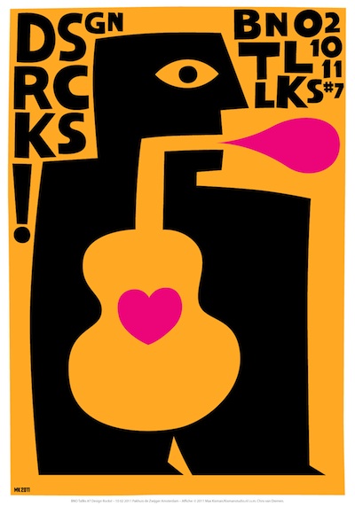
BNO DESIGN TALLKS
Design Rocks Art Print
(2011_0224) A little late with the update. On February 10, accompanied by DBXL and FPCM I performed with short musical breaks between speakers of the annual Design Rocks symposium of the BNO. For the occasion I created an image and collaborated on the offset art print with Chris van Diemen. Two versions in fluorescent yellow or green w/black and magenta. Colors might vary from website image. Available for €15, signed and shipped in a tube. Write an email to order.
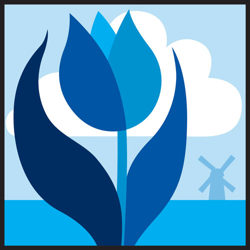
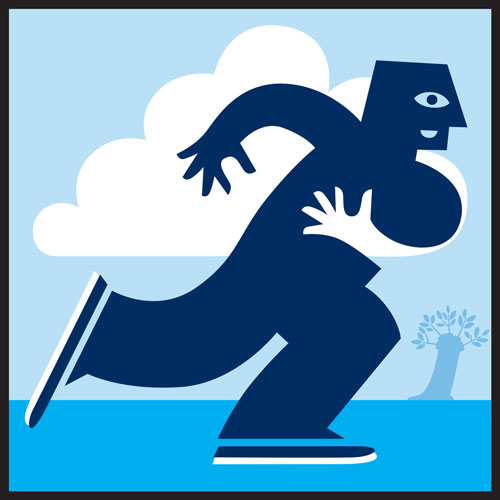
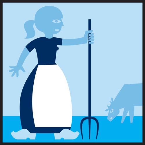
Pictographs for
Schiphol Parking
(2013_1121) When you park your car at Schiphol Parking, you will remember its location by the icons of a typical Dutch tulip, windmill and skater designed by Max Kisman. Readers of the "Financieel Dagblad" or "De Volkskrant" recognize the distinctive visual language of the clear line that combines with the play of form and counter shape. The designs are also incorporated in the light walls that illuminate the attractive entry halls.
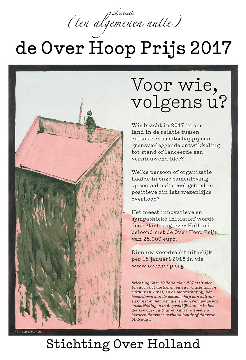
(2018_0115) Kismanstudio werkt sinds 1987 aan de vormgeving van publicaties en communicatie van Museum Over Holland (destijds in aan het Amsterdamse Museumplein) en stichting Overholland. In 2014 gaf Kismanstudio vorm aan de campagne tegen de belangen conflicten in het Stedelijk Museum te Amsterdam. In 2017 maakten we de campagne voor nominaties voor de Over Hoop Prijs 2017 en pasten we de oude website aan met nieuwe functionaliteiten. overholland.org overhoop.org
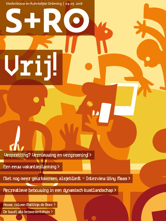
Stedenbouw en Ruimtelijke Ordening S+RO 2010-2017 Kismanstudio produced the design and lay-out of S+RO a magazine about city building and urban development over a period of 7 years. The design included many unique ilustrations, visuals and specific infographics. The magazine switched publishers thee times. Due to external and internal econmical changes the budgets for a dedicated and attentive design deminished. Check out the covers of all issues here
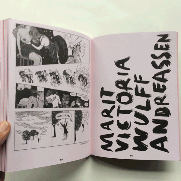
(2017_0930) FUKT is a magazine for contemporary drawing. It comes without ads, beautifully designed with a focus on the visual, with occasional interviews with interesting artists and essays by engaging authors. The design and format are changing for each issue. This new issue features 23 artistic positions focusing on erotic contemporary drawing. FUKT #16 is presenting a broad range of different techniques and expression. With: Alphachanneling, Audrey Jones, Aurel Schmidt, Bettina Krieg, Bjarne Melgaard, David Shrigley, Frances Waite, Fredster, Gagan Singh, Keith Haring, Marit Victoria Wulff Andreassen, Marlene Dumas, Martin Skauen, Max Kisman, Minzo King, Moussa Kone, Mrzyk/Moriceau, Patrick Angus, Paul Davis, Steingrim Veum, Stewart Helm, Tommy Olsson, Tracey Emin, Ulli Lust
Editor: Björn Hegardt, Berlin
Design: Ariane Spanier, Berlin
ISBN: 978-3-95763-399-6
16,5 cm x 23 cm
230 pagina’s, full color fuktmagazine.com
A few copies available at ByKisman
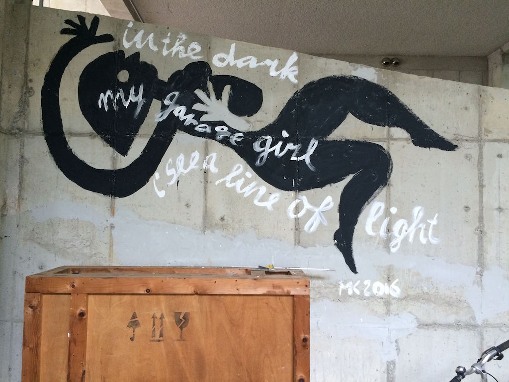
Garage girl
(2017_0901) A year ago (2016) I painted an improvised mural in the garage of the PaTi (Paju Typography Institute), Seoul during an excursion of the AGI Open/Congress. The piece caused a certain change of direction in my practice.
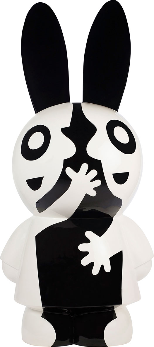
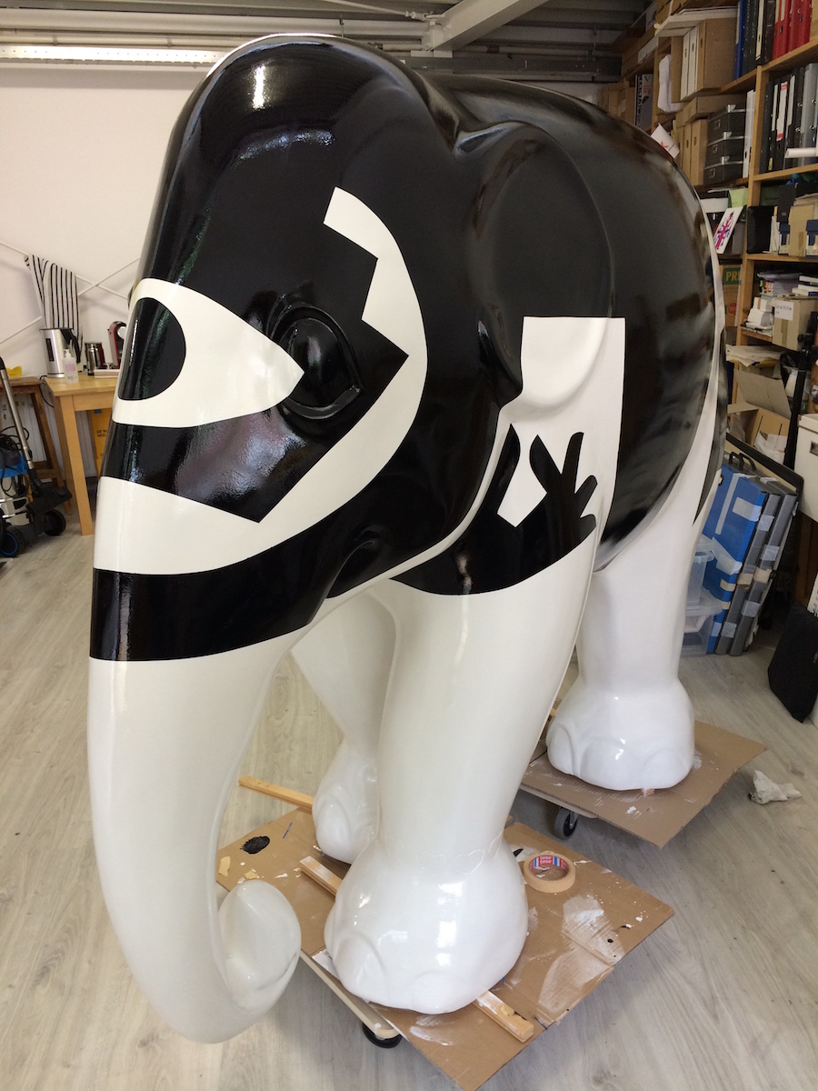
Elephant Parade Laren 2017 (2017_0414) The Elephant's Eye design by Max Kisman will be shown this summer in the Elephants Parade in collaboration the Singer Museum in Laren openins June 18. Read more (Dutch)>>
Hug an elephant (2016_0616) ‘Elephant's Hug’ is my contribution to the upcoming Elephants parade exhibitions. Read more >>
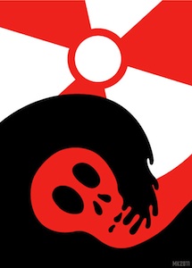
Nuclear Power!
(2011_0318) Image to an essay on risks and effects of nature on Nuclear Power plants, Financieel Dagblad, Saturday 19 March.
No Guts No Glory
(2011_0305) Logo designed for AlexSlagter's No Guts No Glory foundation to raise funds for uninsured cancer treatments.The project is called 41x41 | 41+41. 41 artists will create 41 art prints, 41 copies, to be sold for €82. Aming at €140.000, enough to cover ten treatmenst for 4 patients. Twitter: #nogutsnoglory Animations (2010_0912) I have posted a few animations: First Serve (2007) Your President (2008) Met het oog op morgen (2009) Holland Doc 24 design (2007)
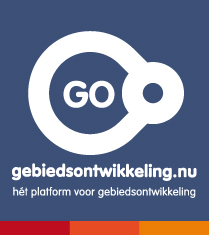
(2010_1101) KismanVerhaak designed the identity and interaction plan and graphic design of the portal Gebiedsontwikkeling.nu. GO is an independent platform and (knowledge) network for anyone professionally involved with city planning and urban development. The platform provides news and updates about area development, an agenda of events, meetings and conferences etc. background information and views on urban and of land development. Language used is Dutch. Technical realisation is by Creative Dutchmen
Kisman T-shirt for Dutch Illustration Biannual
(2010_0605) Limited edition T-shirt with a special design I made for the Illustration Biannual. This is a new Dutch event that aims to show the power and variety of illustration in a versatile program, full of visual elements. Saturday June 5, Toneelschuur, Haarlem.
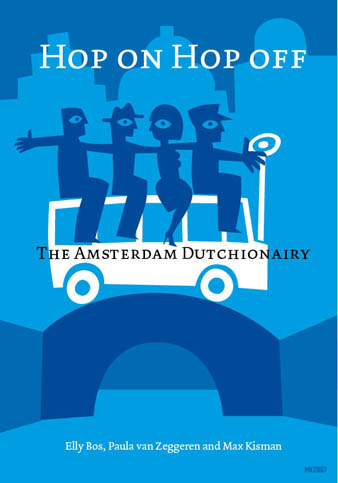
Amsterdam Dutchionary Illustrations and texts for the Amsterdam Dutchionary in the 2007 AGI conference guide are nowpublished on the AGI website.
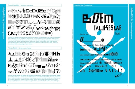
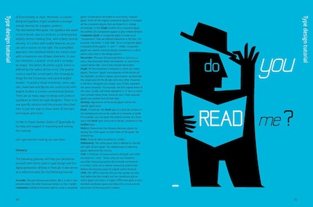
We Love Your (Free) Fonts! (2010_0824) Holland Fonts (my font foundry) features in the second volume of Free Font Index 2 with 9 free fonts, including the compilations "Dutch Doubles" (2004, 37 Dutch designers), "Frisco-Remix" (2003, 34 Bay area designers), "MaxMix One" (1990, Typ magazine), "We Love Your" (1986-2003, found objects, Typ magazine) and Metropole. The book contains over 500 fonts by type foundries and designers, like Donald Beekman, Jakob Fisher, Ray Larabie, Ellen Lupton, Martin Majoor and Svetoslav Simov.
My type workshop to design and produce your own font "Do You Read Me?" has been updated especially for this publication in collaboration with Typemafia's Gerben Dollen. Free Fonts Index is edited and designed by Hans Lijklema and published in June 2010 by the Pepin Press.
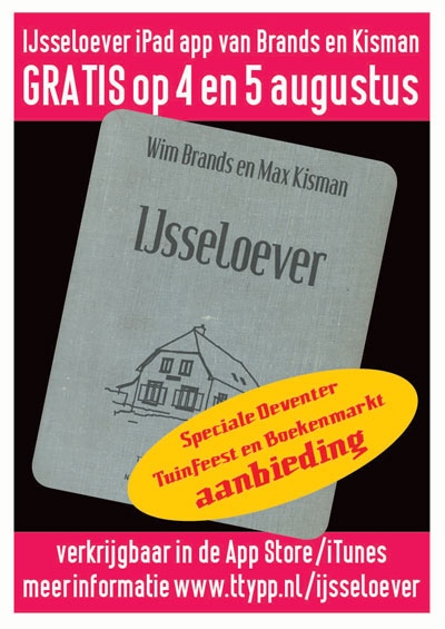
IJsseloever app offer...
(2012_0727) For the occassion of the Garden Poetry Fest in Deventer IJsseloever will be a FREE download for iPad on Saturday 4 and Sunday 5 August.
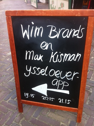
Brands&Kisman perform in Deventer, August 4
(2012_0720) On Saturday 4 August Poet Wim Brands and designer/illustrator Max Kisman perform and talk about IJsseloever at the Garden Poetry Fest in Deventer (NL) at 19:15, 20:15 and 21:15 hrs in the Iodenhuis. This annual poetry festival takes place in historical gardens in Deventer prior to the largest European antique book market on Sunday 5 August.
IJsseloever for iPad and Android tablets
(2012_0430) For the project 'Poetry on the mobile screen' initiated by the Dutch Foundation for Literature and Mondrian Foundation, poet Wim Brands and graphic designer Max Kisman made the iPad app ”IJsseloever”: Sixteen moments of the lives of two elderly women are hidden in the IJssel river valley (NL). They watch the ships, read their names and in their minds they sail to foreign countries. The story also contains 15 video poems and one audio clip. IJsseloever is the second app published by TYP/Three Publishers and is available from 17 May in the App Store for €1,59. Language: Dutch. For more information visit ttypp.nl/ijsseloever
Brands&Kisman join again in Tekst/Figuur
(2013_0614) Wim Brands and I (and twenty others) made a contribution to the Mashville edition Text/Figure: an experiment to poets and image makers to influence each other's work. This method is to react and intervene in the work of the other. More here. Or on facebook.
Shake hands with your friends in Boxmeer, NL
(2010_0731) De Vriendschap (The Friendship) is the new kid on the block in food wise Boxmeer, a small town in the province of Limburg, NL. Quailtiy fries and burgers from local produce and meat. To go, home delivery or a beautiful tasty plate for lunch or dinner in the restaurant. Appreciation of the owners for my weekly images in the Dutch Financial Journal turned into a screen print trip tych expressing three stages of friendship and a vignette of a hand shake for their logo. If you are in the area and ready for a bite or just want to make the trip out there, this is a recommendation. Marten Jongema (1951-2011) Marten Jongema died after a sick bed on Thursday 7 April 2011. Only a week before he would be 60 years old. More than colleagues Marten and I were friends. We met at SSP printers in the 80s where we often drank a lot of coffee and talked. We collaborated on the posters for Paradiso. I tried to do something out of his repertoire and he out of mine, only to find out that it was special what the other did. More >>
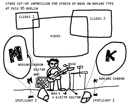
Although it didn't work out that way I made this stage design or my performance : )
Complexity of Simplicity in Istanbul
(2012_0509) Max Kisman's Complexity of Simplicity exhibition and workshop at Grafist 16 takes place from 7-11 May 2012 in the MImar Sinan University inIstanbul, Turkey. More photo's on facebook.
 (2018_0918) This summer, Max Kisman created a mural design for the offices of the Professional Dutch Designers Association BNO in Amsterdam. Over the weekend of 14-16 september he caftfully applied the mural of various typical Kisman slihouette figures in black with a poetic text in white.